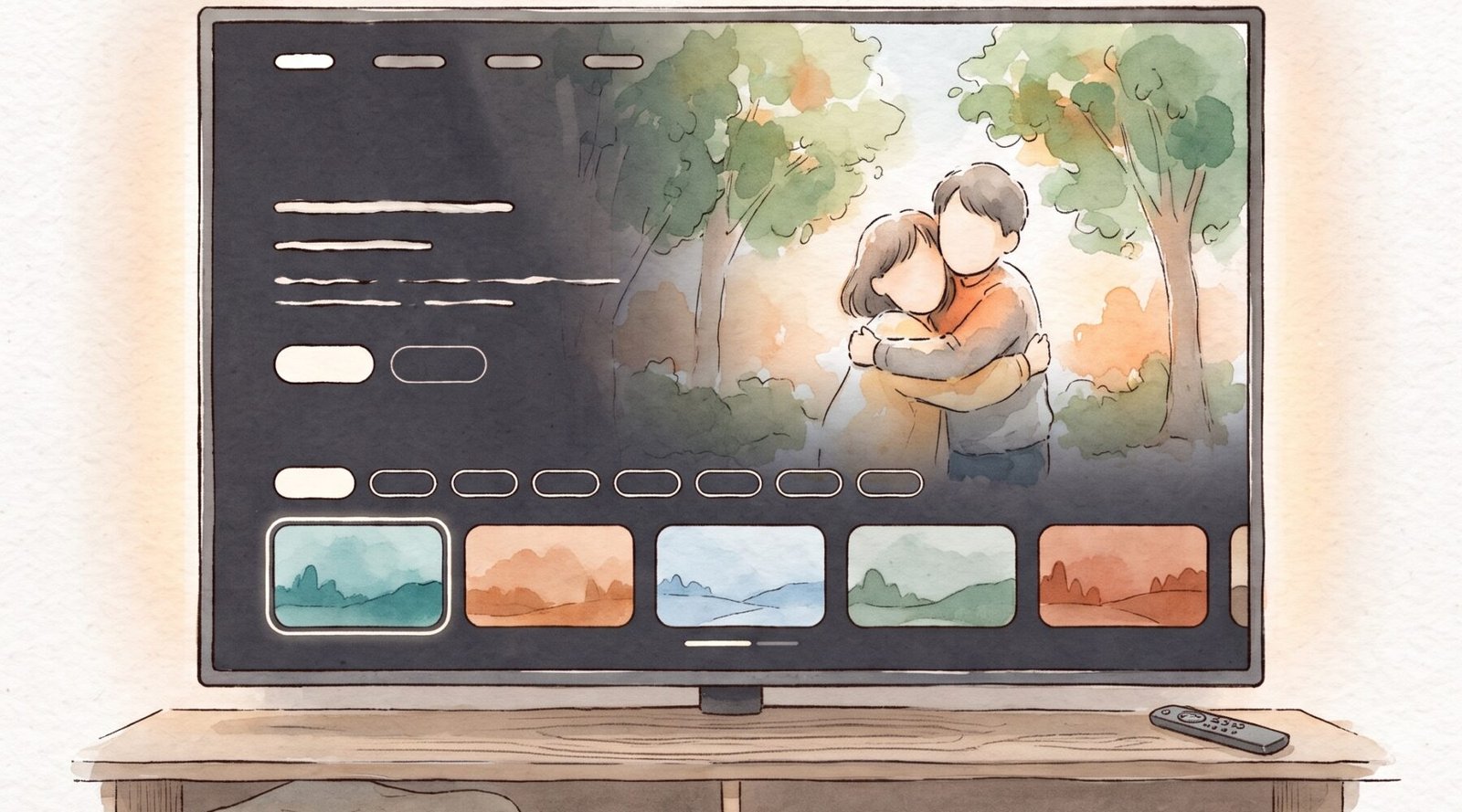
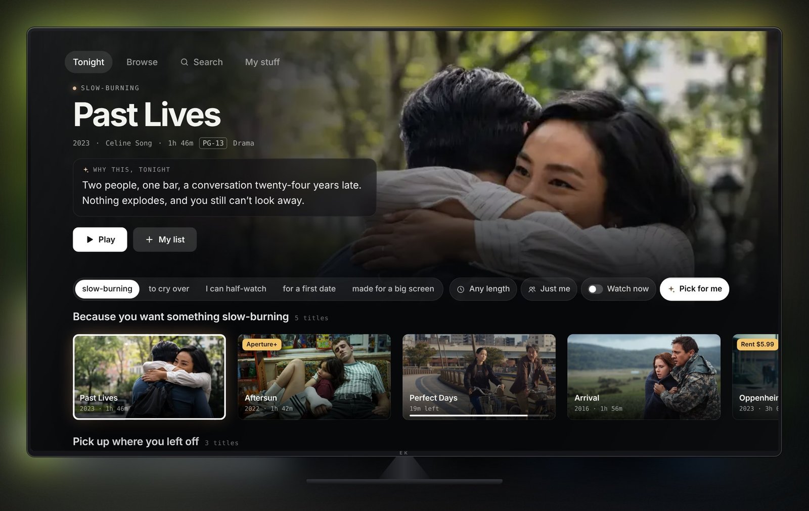
Aperture is a streaming home screen I designed and built that starts from how you want tonight to feel, not from a genre. It tells you why each film fits, and it’s honest about what everything costs. It runs on TV, web and phone, and every screen works.
The idea
For five years I’ve written a version of one sentence for @erfesh almost every day: here’s why this one, for you, tonight. That habit taught me something streaming apps still miss. People don’t choose by genre. They choose by mood: how much attention they have left, who’s on the couch, whether tonight can take a sad ending.
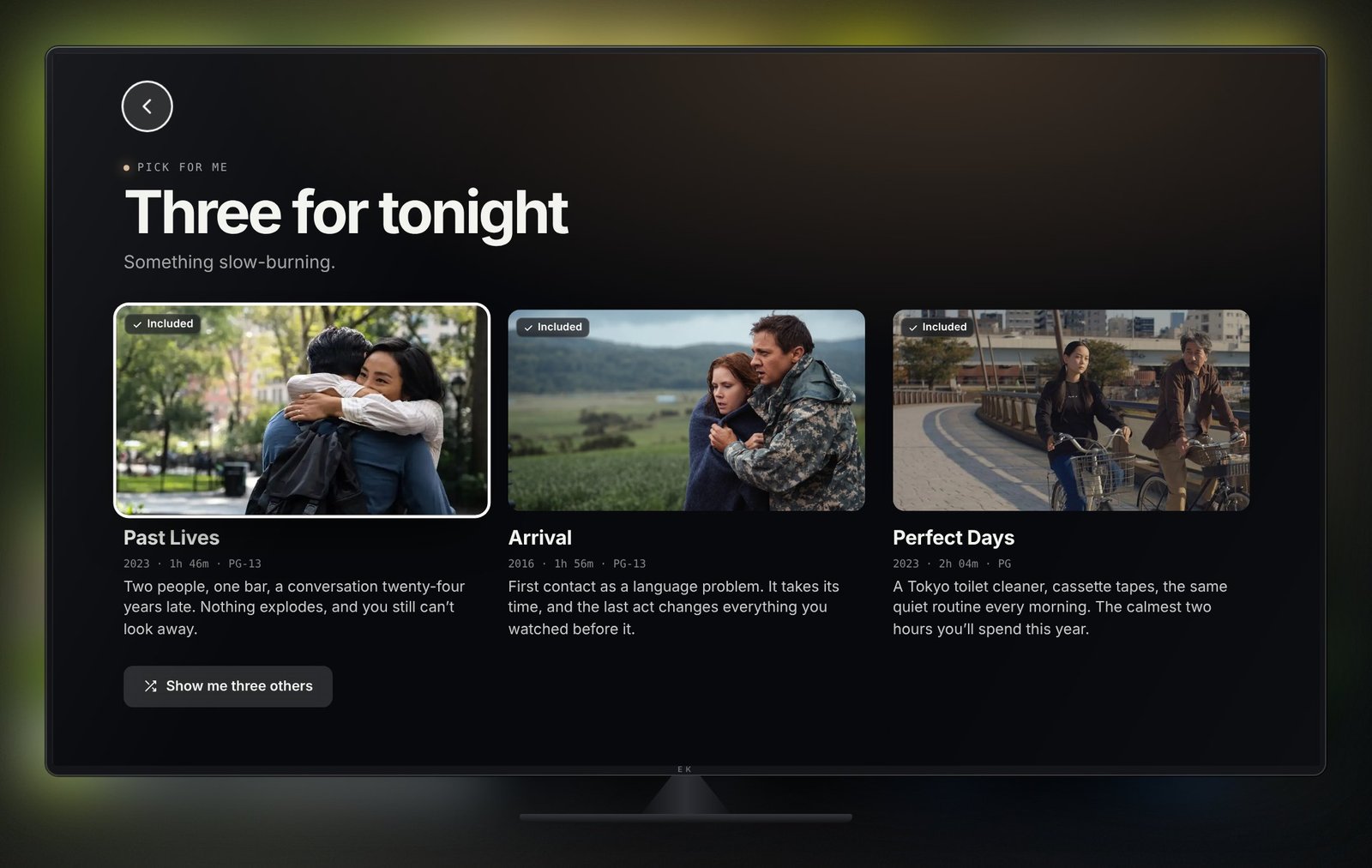
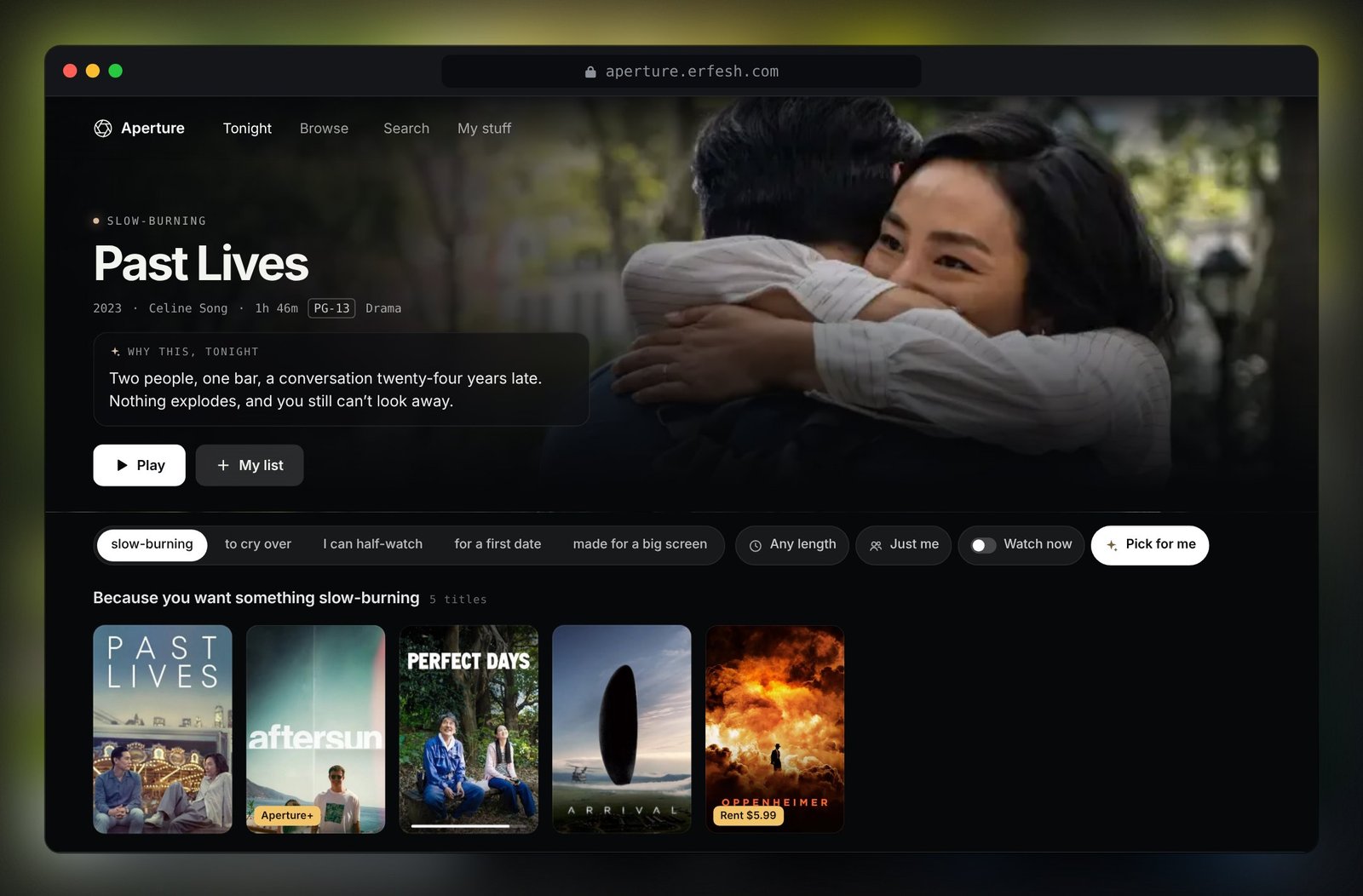
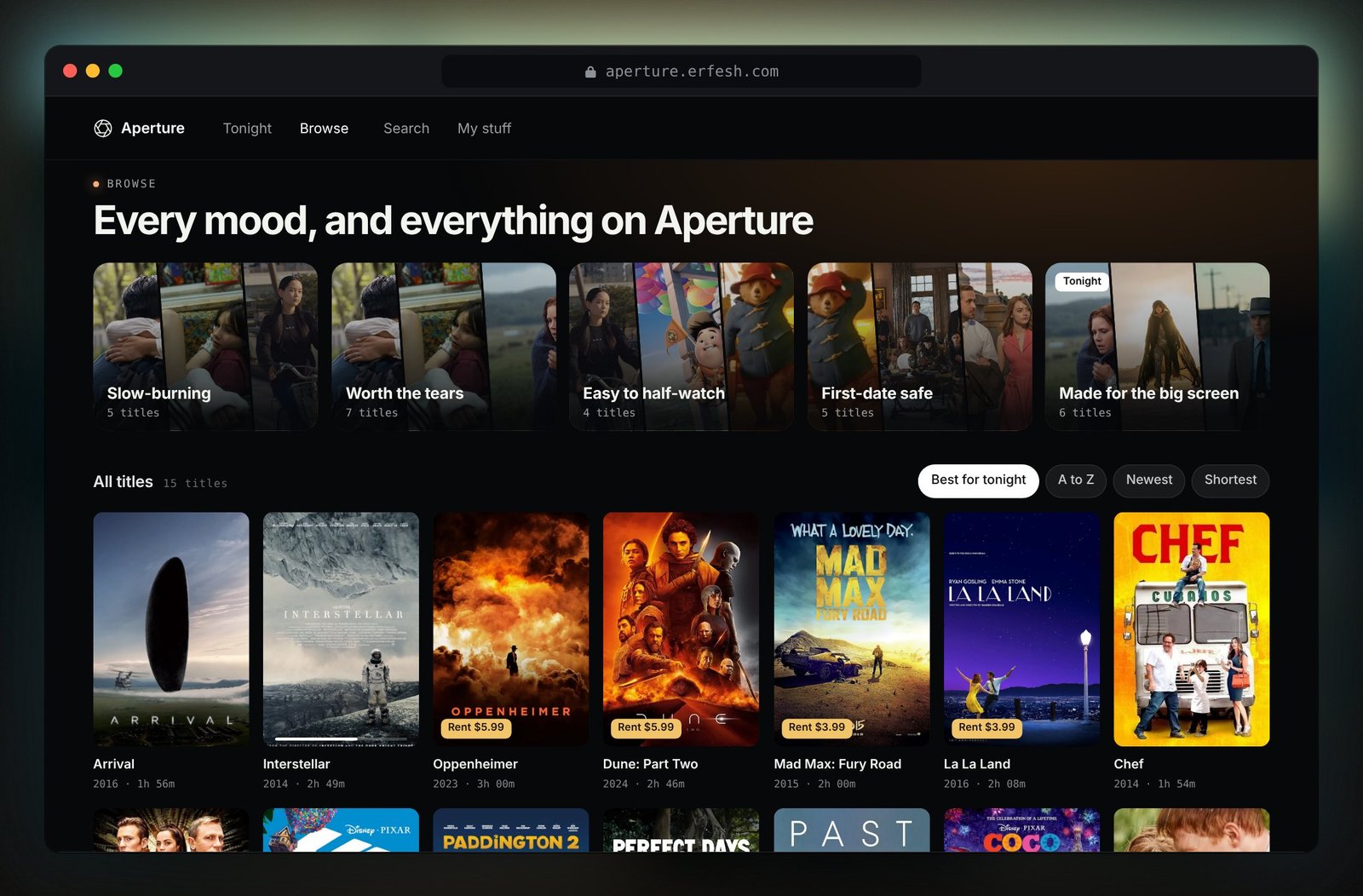
So Aperture swaps genre rows for mood rows. You tell it you want something slow-burning, something to cry over, something you can half-watch, something safe for a first date or something made for a big screen, and the whole screen changes with you. Every title gets one short, specific reason in place of a star rating, the kind of line a friend would text you.
The reasons are written by hand on purpose. They show the voice an AI step should match before anyone wires one up, which is the part I think product teams skip.
What streaming apps get wrong, and the fix
I started from four complaints I hear about every big streaming app, then designed one answer for each.
- Too much choiceEndless rows make deciding harder, not easier.
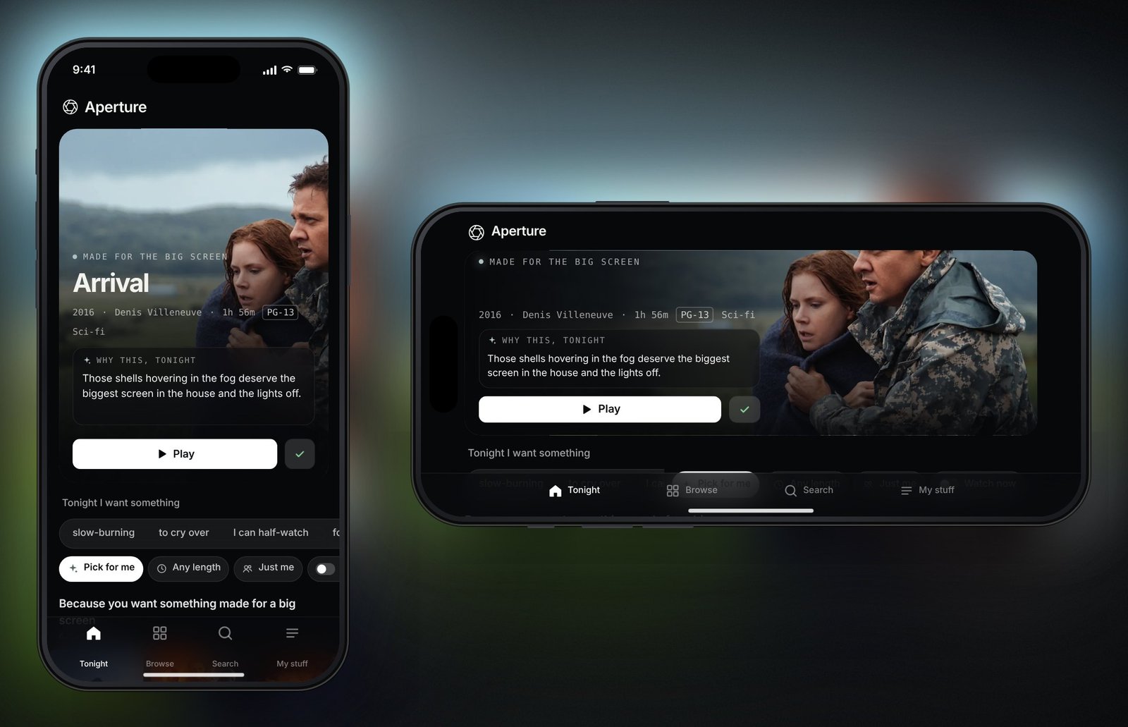
The Tonight bar asks the three things people settle first: mood, how much time, and who’s watching. Pick for me narrows it to three films with their reasons, and “show me three others” walks to the next best three.
- Hidden pricesIncluded titles, rentals and add-ons sit in the same rows.
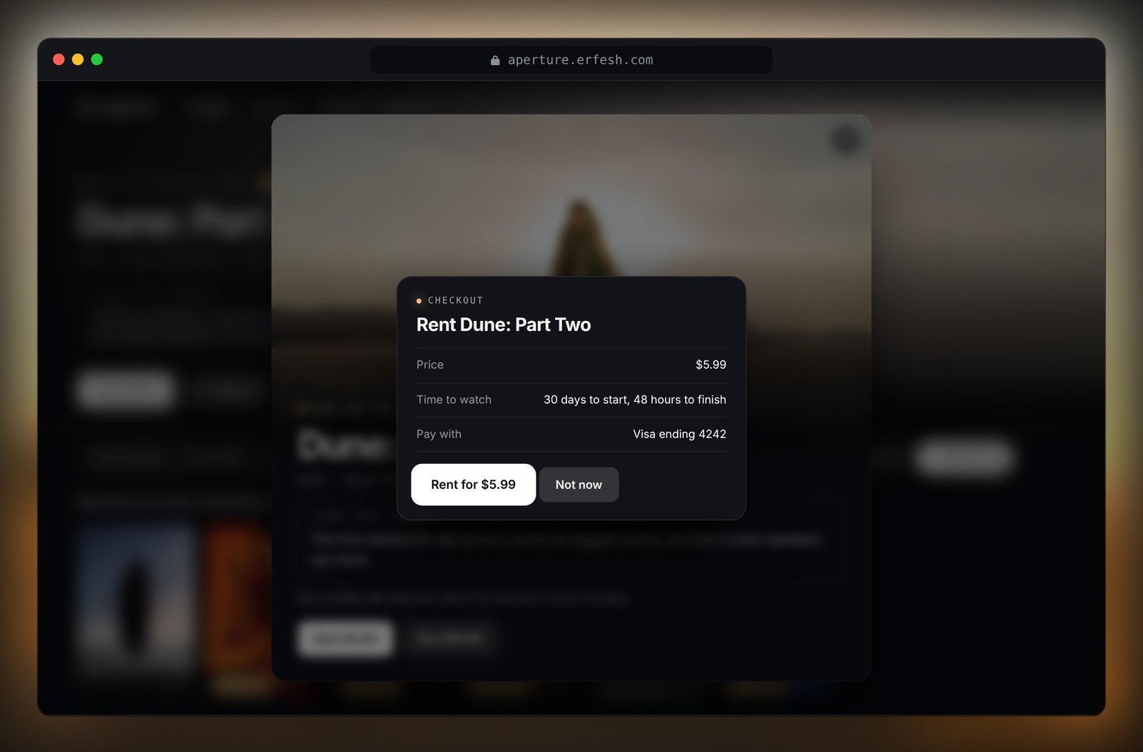
Anything that costs extra is tagged on the card. Watch now hides whatever you’d have to pay for. Checkout is one step: the price, how long you get it, and how to cancel. Canceling Aperture+ is as easy as starting it.
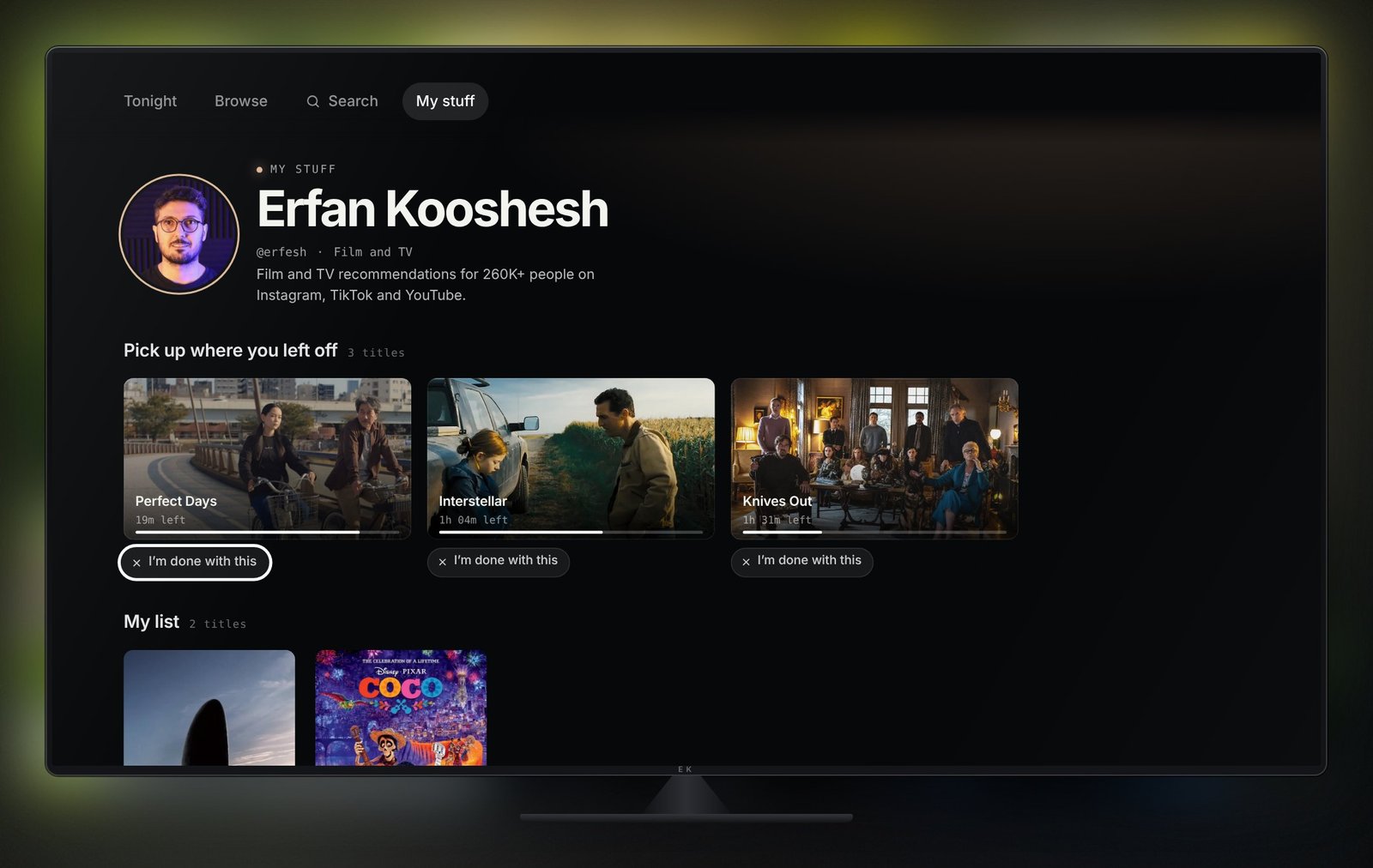
- A cluttered Continue watchingHalf-finished shows you’ll never go back to.
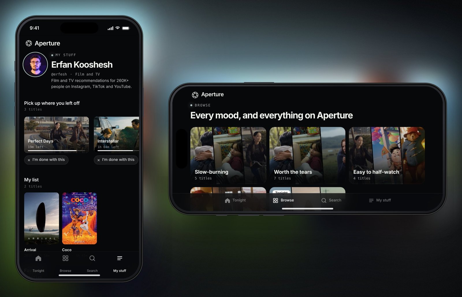
Every title shows how much is left, and one tap (or the back key on a remote) clears it.
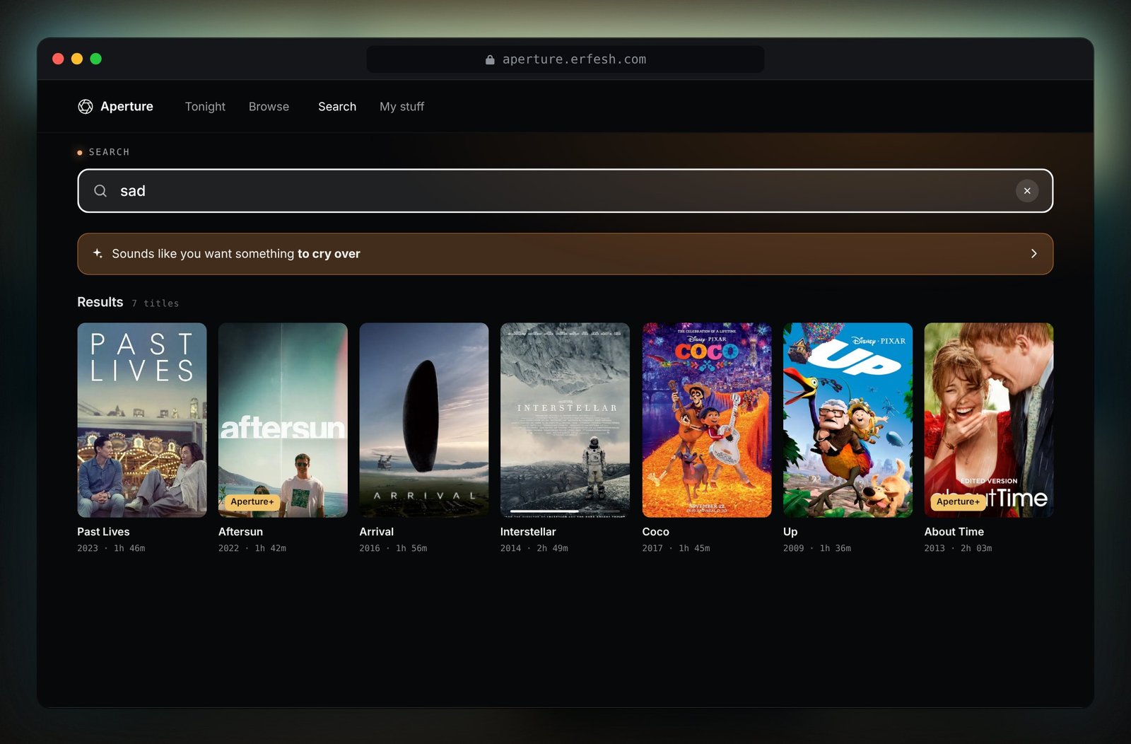
- Dead-end searchNo results, and nowhere to go.
Search understands moods and limits like “sad”, “short” or “kids”. When nothing matches, it says so and offers what fits your mood instead of an empty page.
Built for every screen
One product, three surfaces, each designed for how people actually hold it. Every page works on all three: Tonight, Browse, Search and My stuff.
- TV. Fully navigable with a remote. Arrows move focus, Enter selects, Back returns. Home rows are endless carousels that never show anything to the left on first view. The other pages use spatial navigation, so focus jumps to the nearest item in the direction you press, the way TV operating systems behave. Search has an on-screen keyboard.
- Web. Hover a title to preview it in the pinned hero, click to open it. Arrows page through each row.
- Phone. Shown upright and sideways at the same time. Swipeable rows, bottom tabs, and sheets that slide up for details and checkout. Your profile, favorites and plan all live under My stuff.
How it’s built
Aperture is React 18 written in JSX and compiled ahead of time with esbuild. No other libraries, and no transpiler running in the browser.
- One component tree for three devices. Each surface renders at a fixed size (1280×720 for TV, 1280×760 for web, 390×844 for phone) and scales to fit its mockup, so layouts stay pixel exact at any window size.
- A real async layer with no server. The reasons are hand written, but the client treats them like an API: abortable requests, a cache, a short debounce while focus moves fast, skeleton states, and a word by word reveal like a streamed model response.
- Bias lighting. A blurred copy of what’s on screen glows behind the device in its own shape, the way LED strips behind a TV throw the picture’s colors onto the wall. The page also samples each film’s key art to tint the room.
- Endless carousels without seams. Rows render several copies of their titles and quietly re-center after each move. Rows too short to fill the screen don’t loop at all.
- Motion with restraint. Spring easing, crossfades between titles, a slow drift on the hero, and a camera iris logo that closes and opens when the mood changes. All of it respects reduced motion settings.
What I’d do next
The obvious next step is to put a model behind the reasons, prompted with the hand written ones as the style guide, and test whether people decide faster with them than with ratings. After that, I’d watch where people abandon Pick for me and tune the three questions.
Aperture is a non-commercial design prototype. Film titles and artwork belong to their studios. Prices, the Aperture+ add-on and checkout are fictional; runtimes, directors and ratings are real.