Gatherly: Designing and Building a Social Planning Platform
Role: Founder, product designer and developer (solo): product strategy, UX, visual design, front-end and back-end
Scope: Groups and invites, shared availability calendar, activity voting, plans with RSVPs and itineraries, notifications and email, profiles, admin and theming system, brand identity, Premium subscriptions
Platform: Responsive web app, installable on phones, with a React front end and a PHP API with its own database
Live: gatherly.vip
Timeline: May 2026 – present. The brand refresh and Premium were added in September 2026.
Overview
Every friend group has the same conversation: “We should hang out sometime.” Then twenty messages about dates, three people who never answer, and a plan that quietly dies in the group chat.
Gatherly is the tool I designed and built to fix that. A group shares one calendar where everyone marks the days they’re free. Ideas get suggested and voted on, the best one becomes a plan with a date, an itinerary and real RSVPs, and everyone gets reminded so the plan actually happens.
I’ve been designing and building it since May 2026, solo: product decisions, interface design, the front end, the API and the database. This case study walks through the core product, then the September brand refresh and the Premium subscription system.
The problem
Planning with friends breaks down in three places:
- Finding a date. Group chats are terrible at availability. “Does Saturday work?” turns into a thread nobody can scan.
- Deciding what to do. Ideas get suggested and forgotten, with no sense of what most people actually want.
- Making it real. Even with a date and an idea, nobody knows who’s actually coming, what the plan is, or what it’ll cost.
Design principles
- Answer “when?” at a glance. The most important information, who’s free on which day, should be readable without tapping anything.
- Let the group decide. Voting and RSVPs replace the loudest voice in the chat.
- Move ideas forward. Every screen nudges an idea one step closer to a confirmed plan.
- Calm, not busy. A social app that feels like a nice paper planner, not a feed.
1. Groups
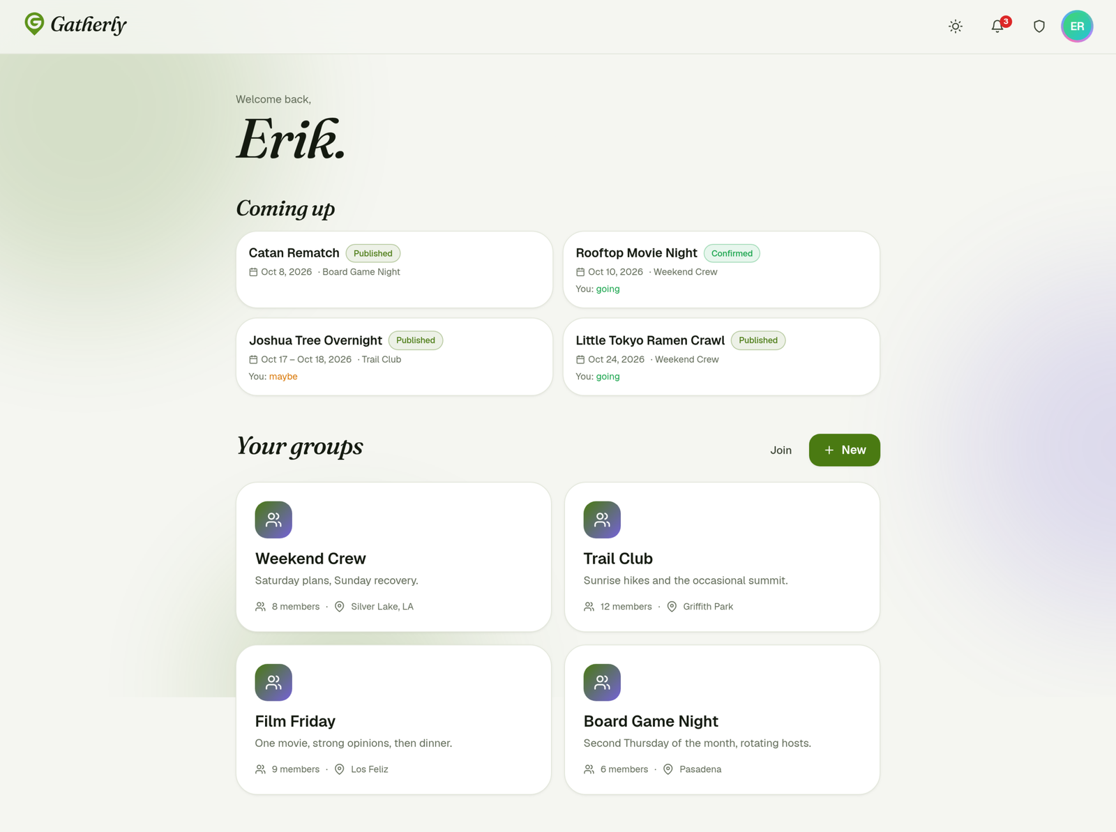
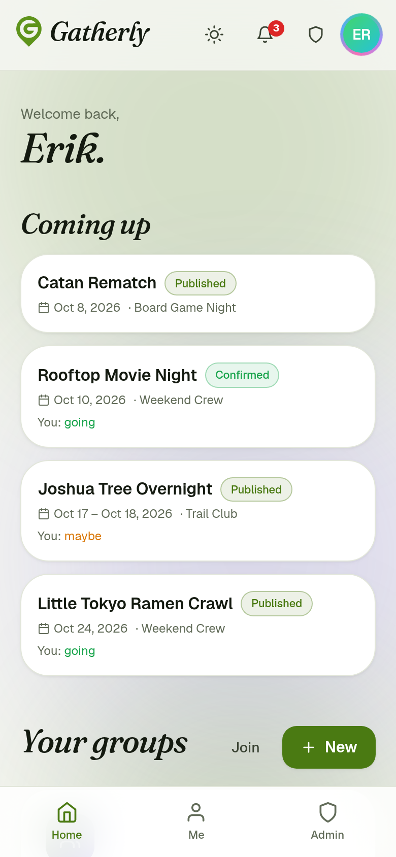
The home screen answers two questions: what’s coming up, and which groups am I in. “Coming up” shows the next plans across all your groups, with each plan’s status and your own RSVP (“You: going”), so you never have to open a group just to remember what you said yes to.
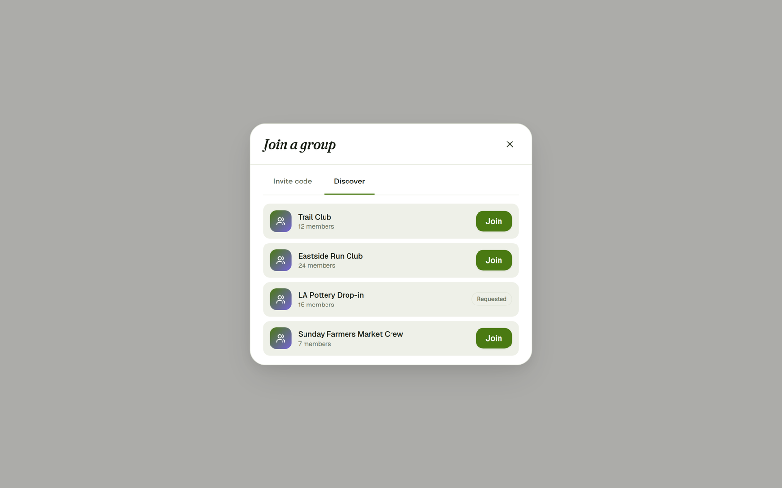
Joining a group works three ways, depending on how private it is:
- Invite code. Every group has a short code (like
WKND4826) that joins you instantly, even into a private group. - Discover. Public groups are listed so new people can find them.
- Request to join. Private groups can be requested, and a group admin approves or declines.
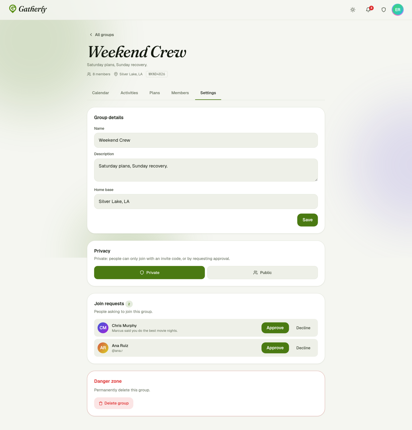
Group admins control privacy and review requests in the group’s settings. A join request carries the person’s note, so the admin has context before approving.
2. The shared calendar
This is the heart of Gatherly.
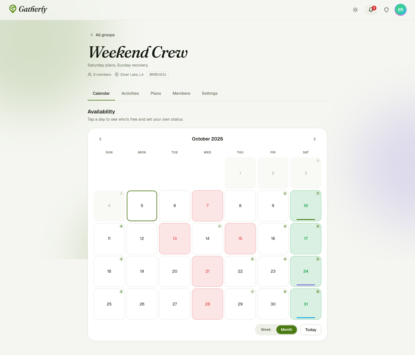
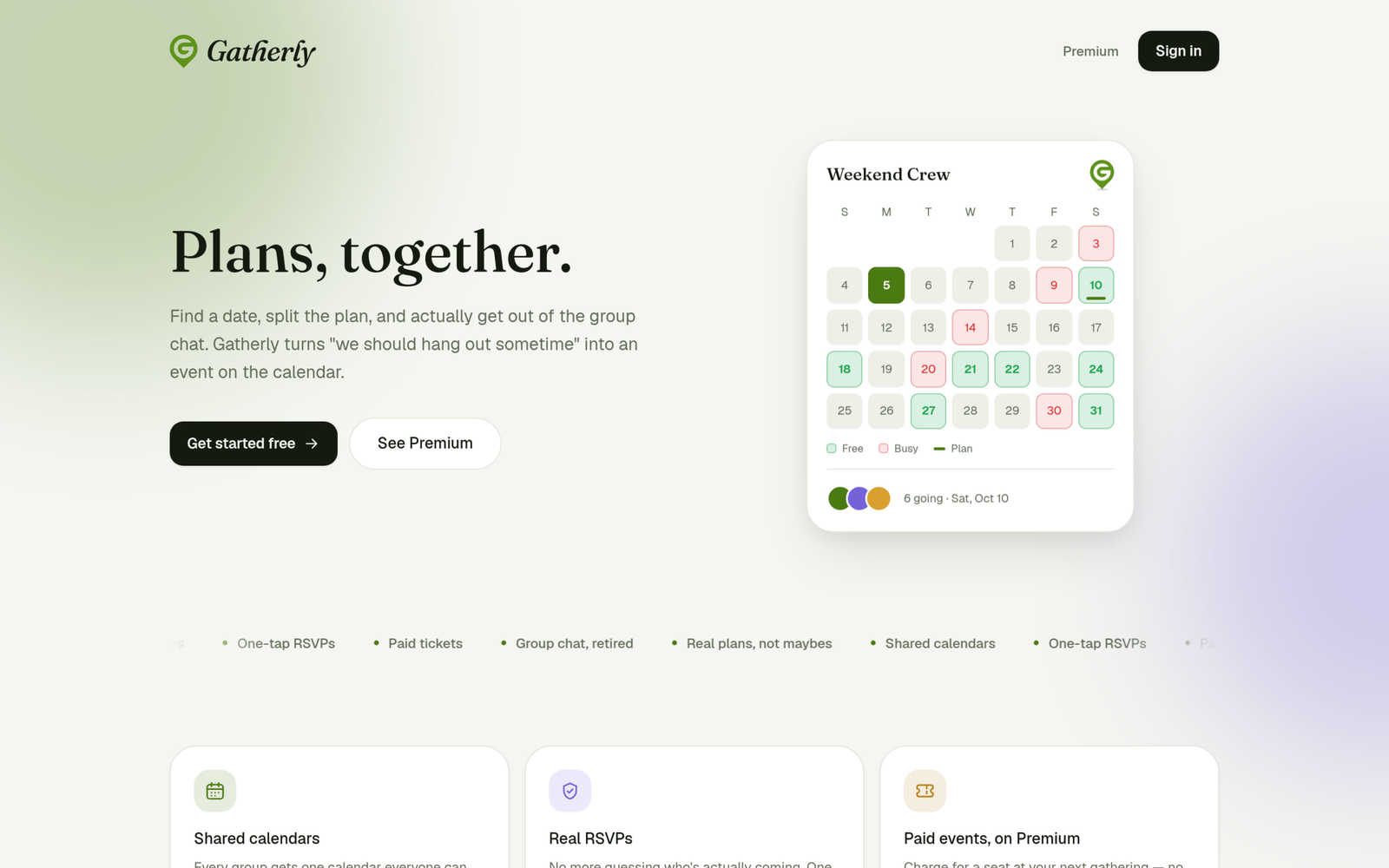
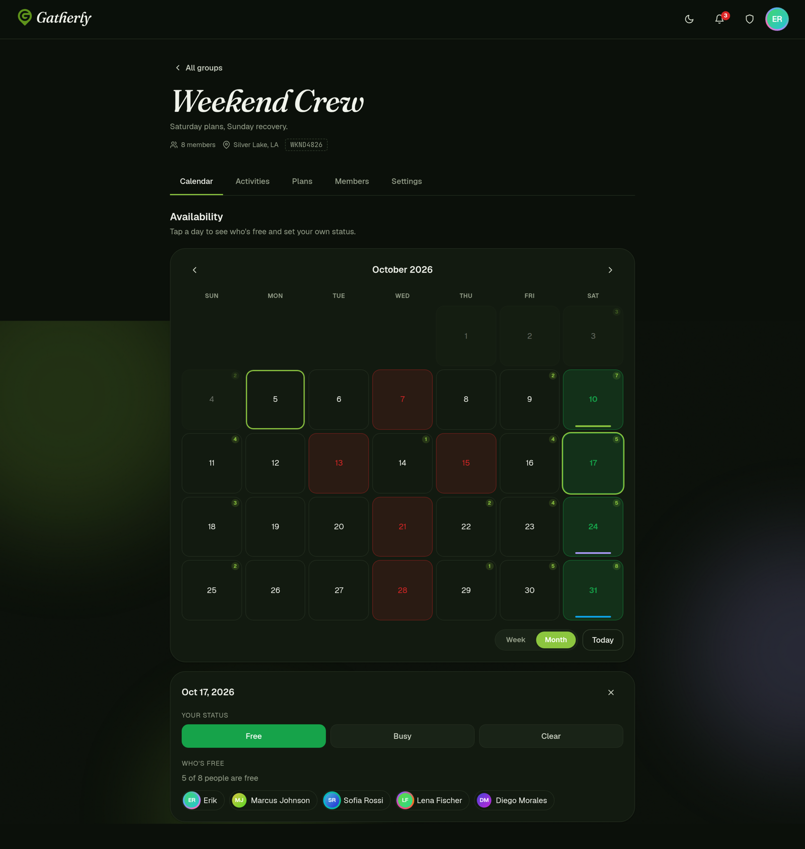
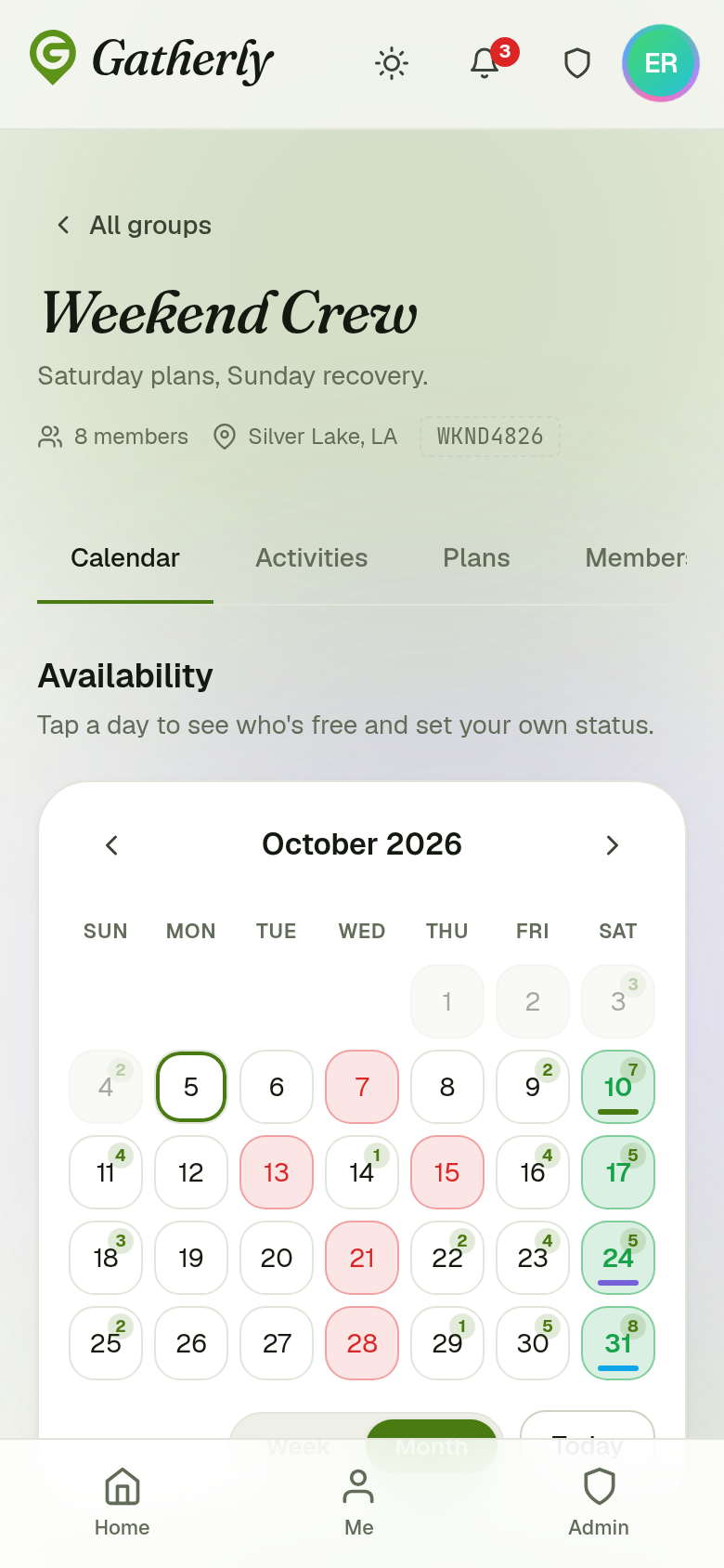
Each person marks days as Free or Busy. The calendar shows your own status as a colored day, and a small badge on every day shows how many people in the group are free. You can see the best day for the group in a second: the busy weekdays, the Saturday where 7 of 8 people are free.
- Plans appear on the calendar as colored bars under their dates, so availability and commitments live in one view.
- Past days are locked and faded, keeping attention on what’s ahead.
- Month and week views, with a Today button.
Tapping a day opens a panel to set your own status, see the plans that day, and see exactly who’s free, with each person’s avatar.
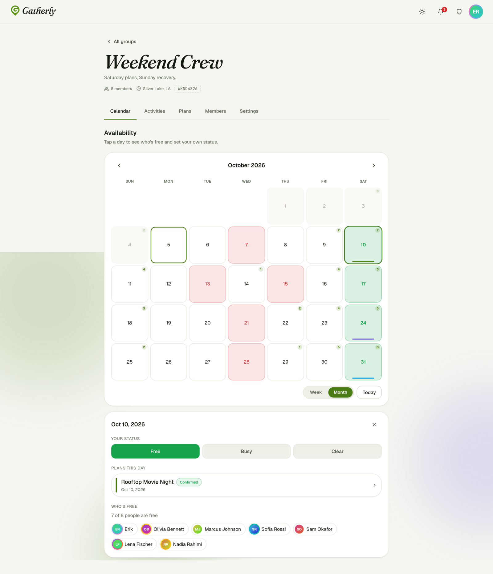
How this panel appears (inline under the calendar or as a pop-up), the default view, and whether members can switch views are all controlled from the admin panel. More on that in section 6.
3. From idea to plan
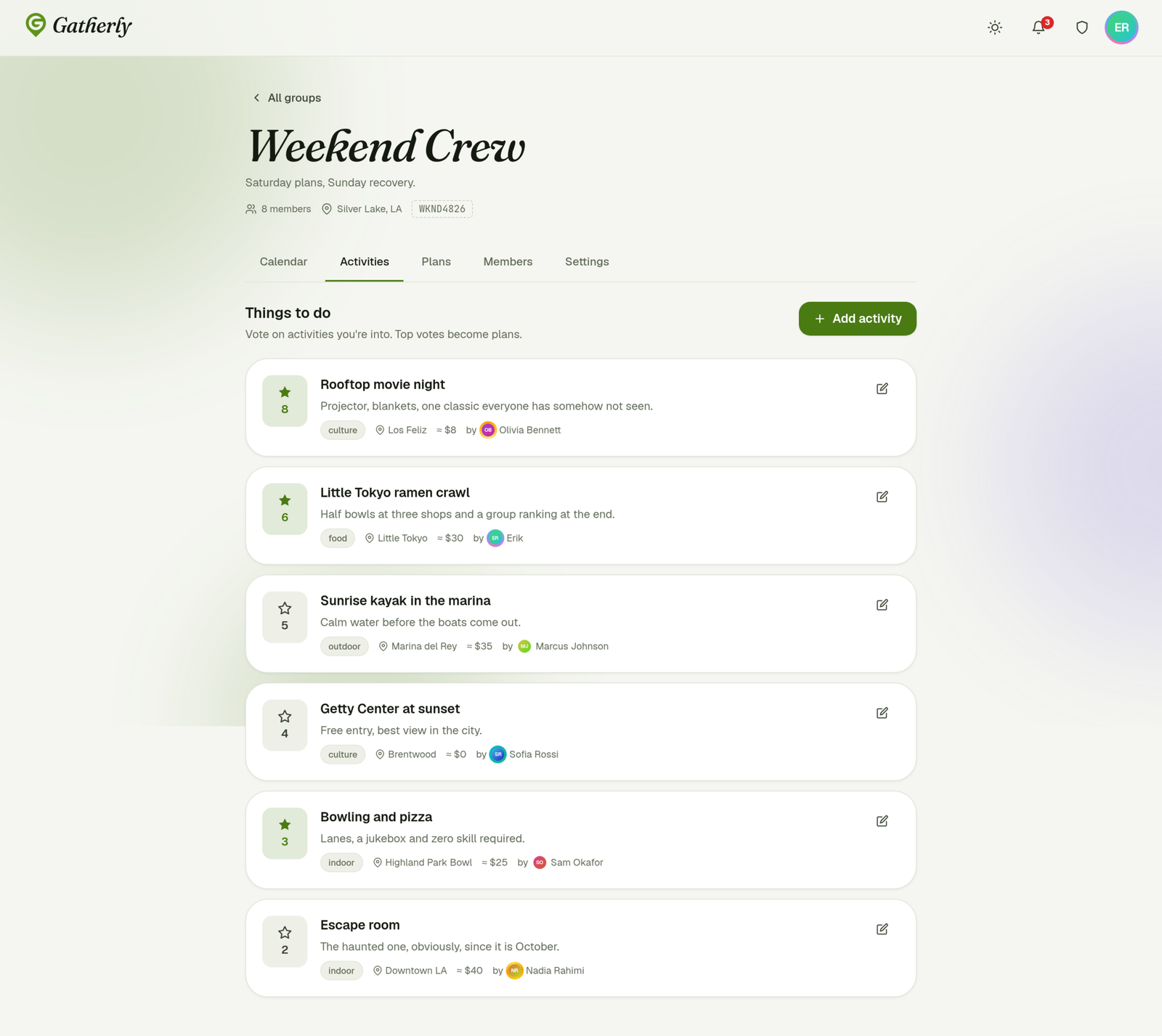
Activities are the group’s shared wishlist. Anyone can suggest something, with a category, location and rough cost, and everyone votes. The list re-sorts by votes, so the group’s real favorites rise to the top. As the screen puts it: top votes become plans.
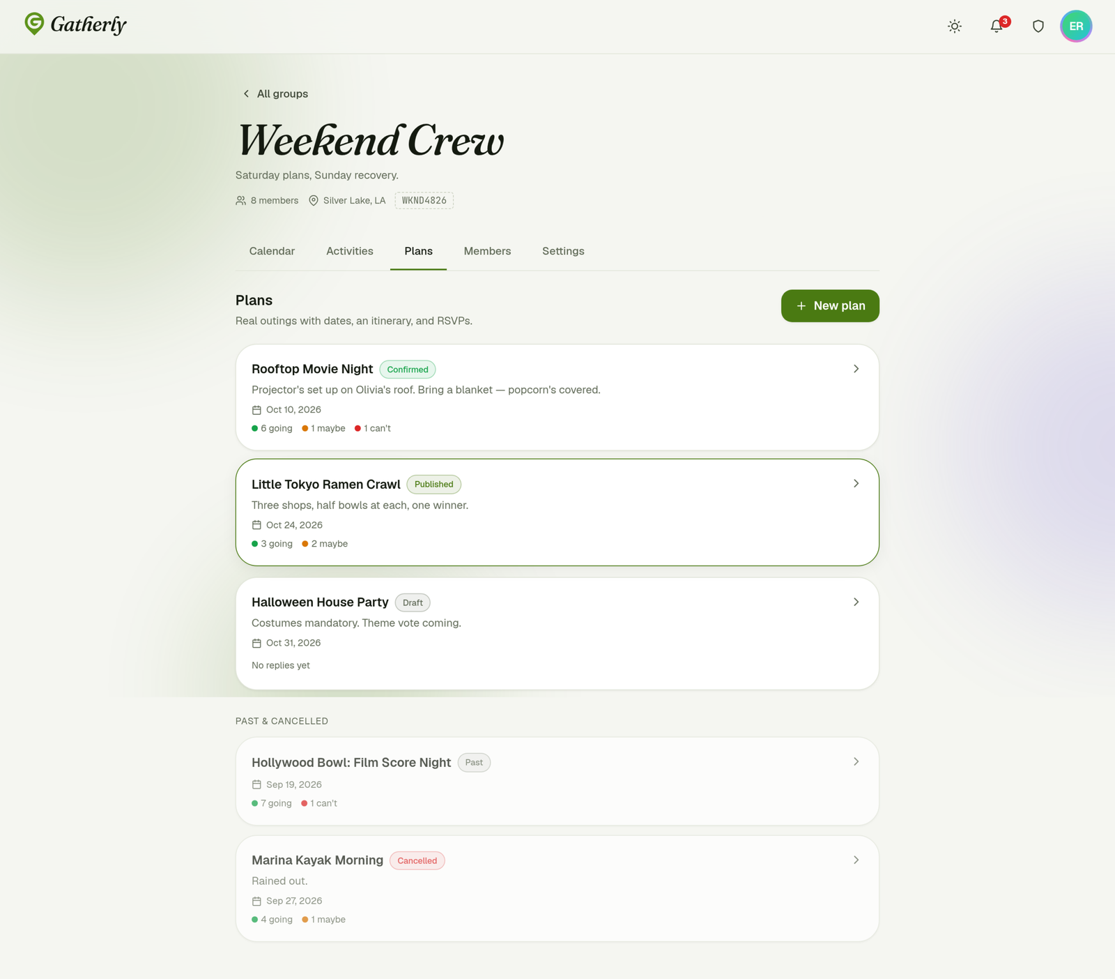
Plans turn an idea into an outing. A plan moves through a simple, visible lifecycle:
- Draft: the organizer is still shaping it
- Published: the group can see it and RSVP
- Confirmed: it’s happening
- Past or Cancelled: moved out of the way into an archive
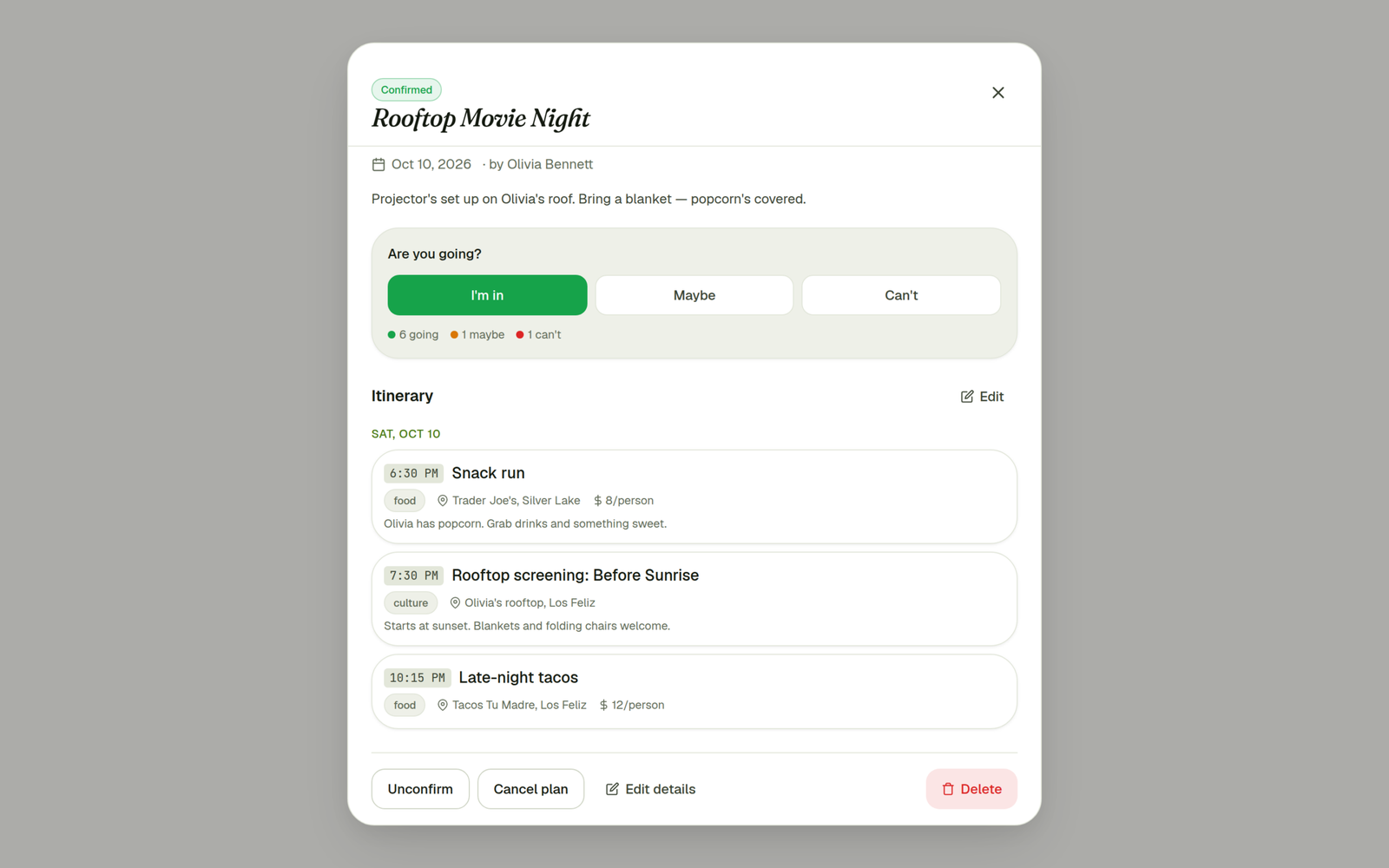
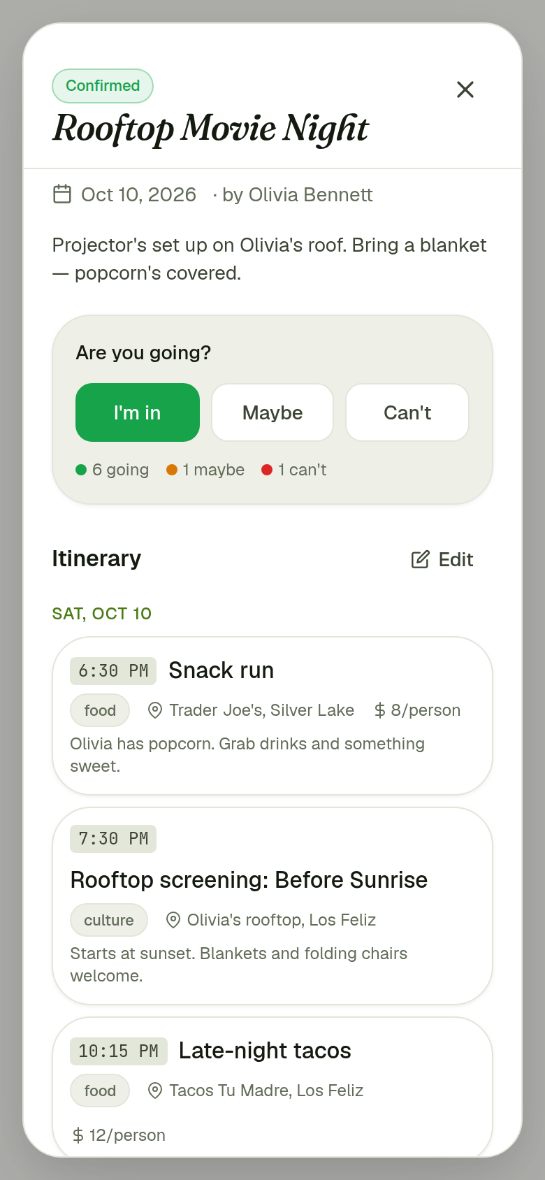
Opening a plan shows everything in one place: date, organizer, a description, the RSVP choices (“I’m in” / “Maybe” / “Can’t”) with live counts, and a day-by-day itinerary. Each stop has a time, a type, a location and a cost marked per person or for the whole group, so nobody is surprised by the bill.
4. Staying in the loop
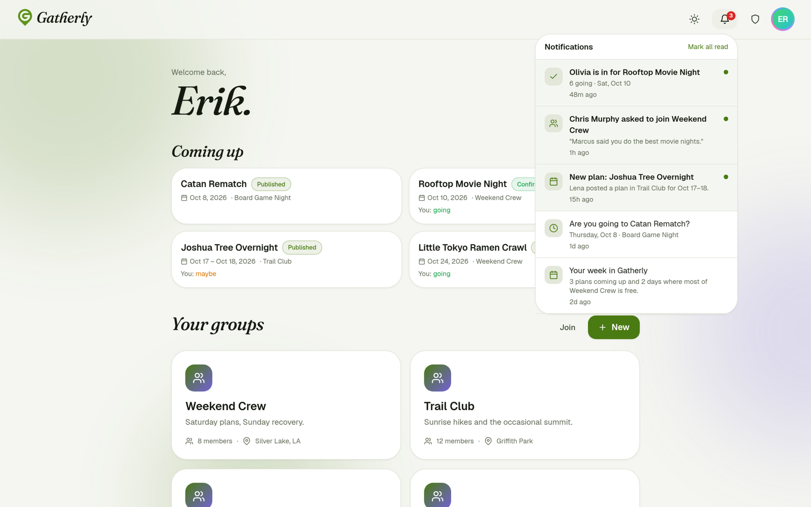
Plans fail when people forget. Gatherly sends in-app notifications for new plans, RSVP updates, reminders to reply, join requests, and a digest of what’s coming up and when the group is free.
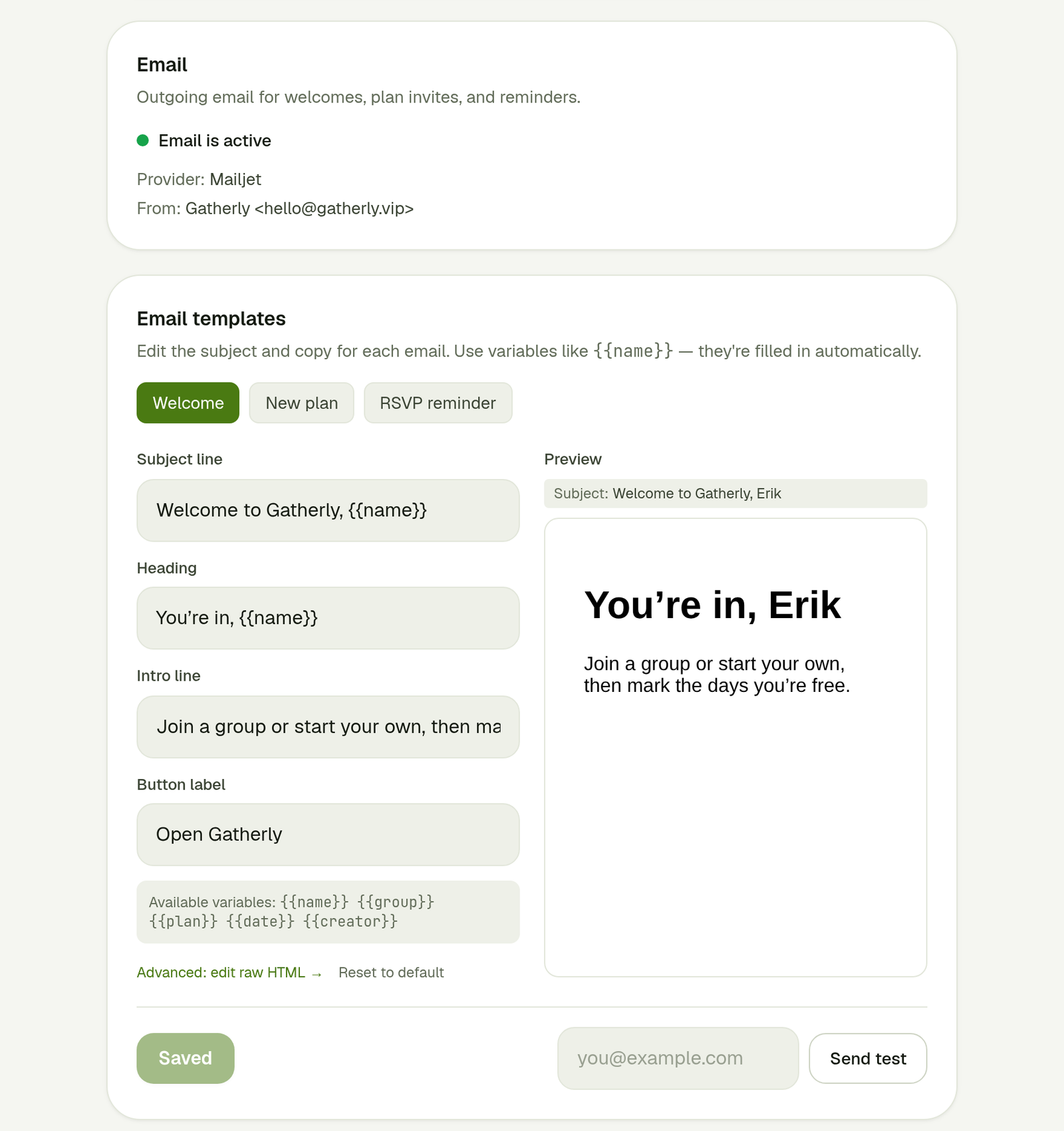
Gatherly also sends email for welcomes, plan invites and reminders. Admins can edit each email’s subject line, heading, intro and button text using variables like {{name}} and {{plan}}, with a live preview and a test send. People can pause emails, and the members list shows who has.
5. People
Every group has roles: the creator, moderators who can manage members and plans, and members. Tapping anyone opens their profile with a bio, home base, the groups you share, and stats on how many plans they’ve attended, suggested and organized.
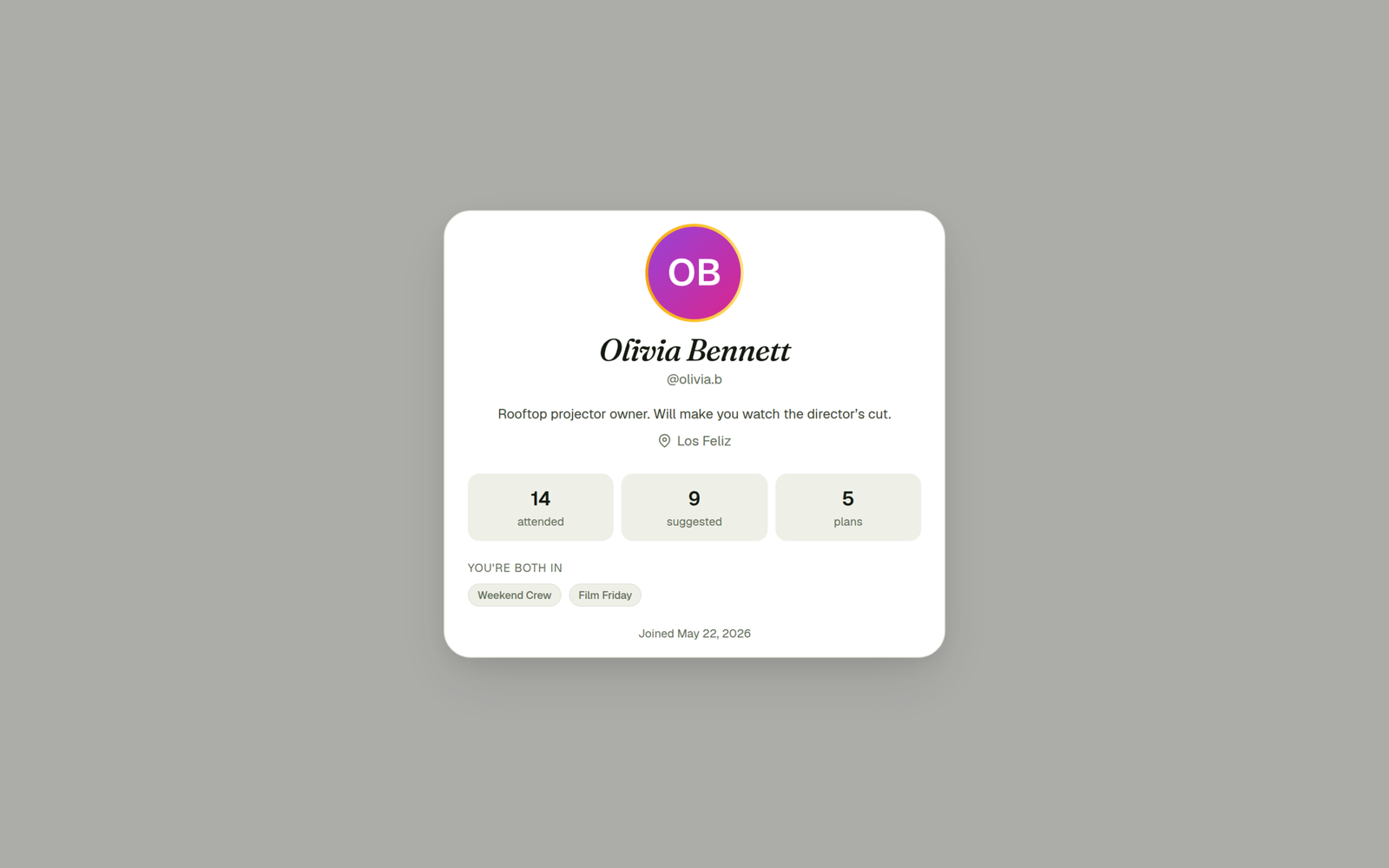
Profiles carry a bit of personality too: an uploaded photo or a generated initials avatar, plus optional animated frames.
6. An admin panel that’s really a design system
I wanted to be able to restyle and reconfigure Gatherly without touching code, so the admin panel controls the product’s identity and behavior:
- Identity: app name, tagline and wordmark style
- Logo and app icon for the browser tab and phones’ home screens
- Color palettes: six tuned presets, each defining accent colors and, for Grove, the full set of neutrals for light and dark mode, plus a custom option
- Registration: open or close new sign-ups
- Calendar behavior: how the day panel appears, the default view, and whether members can switch views
- Default theme: auto, light or dark
- Preset avatars, plus advanced per-token color overrides and custom CSS
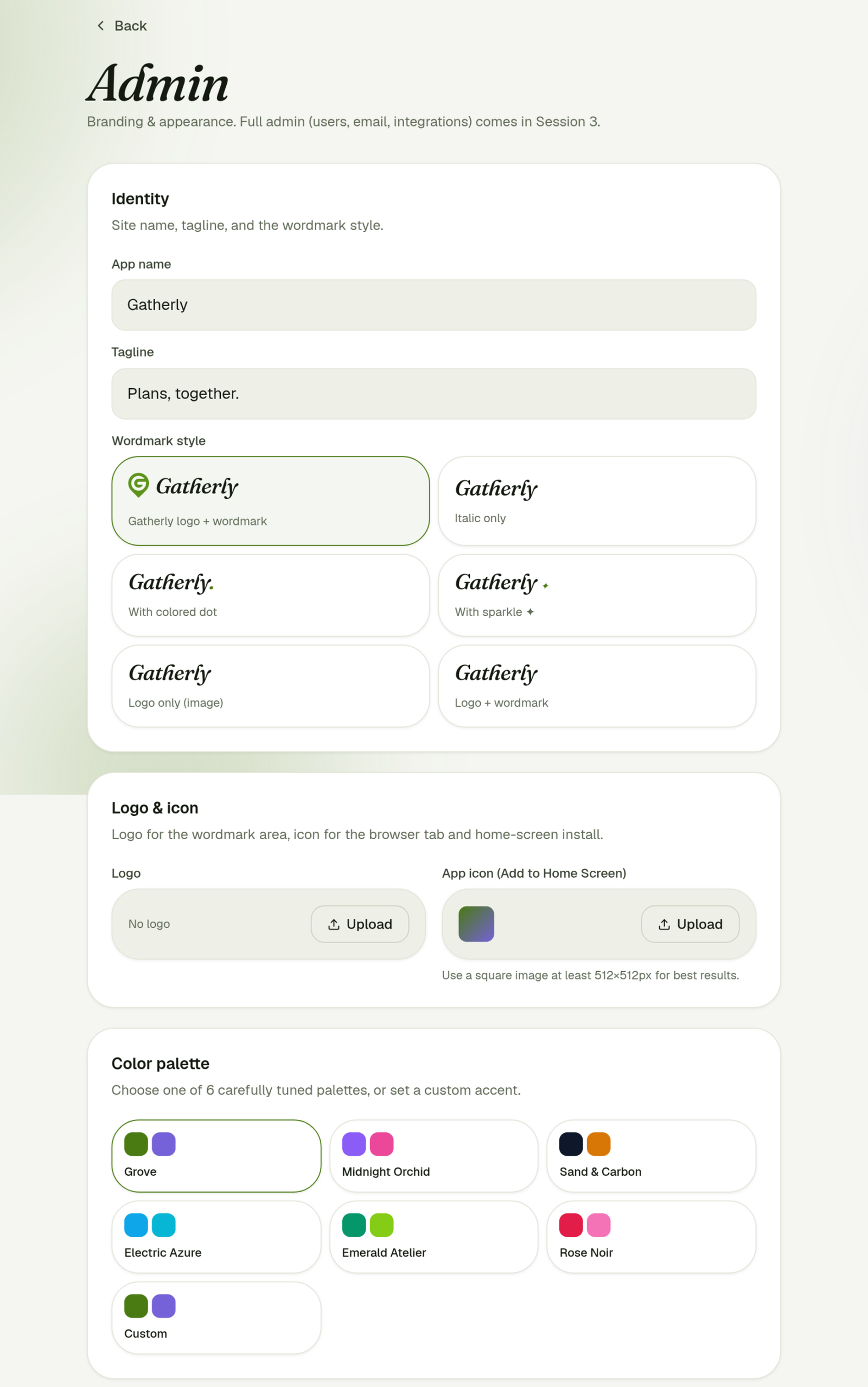
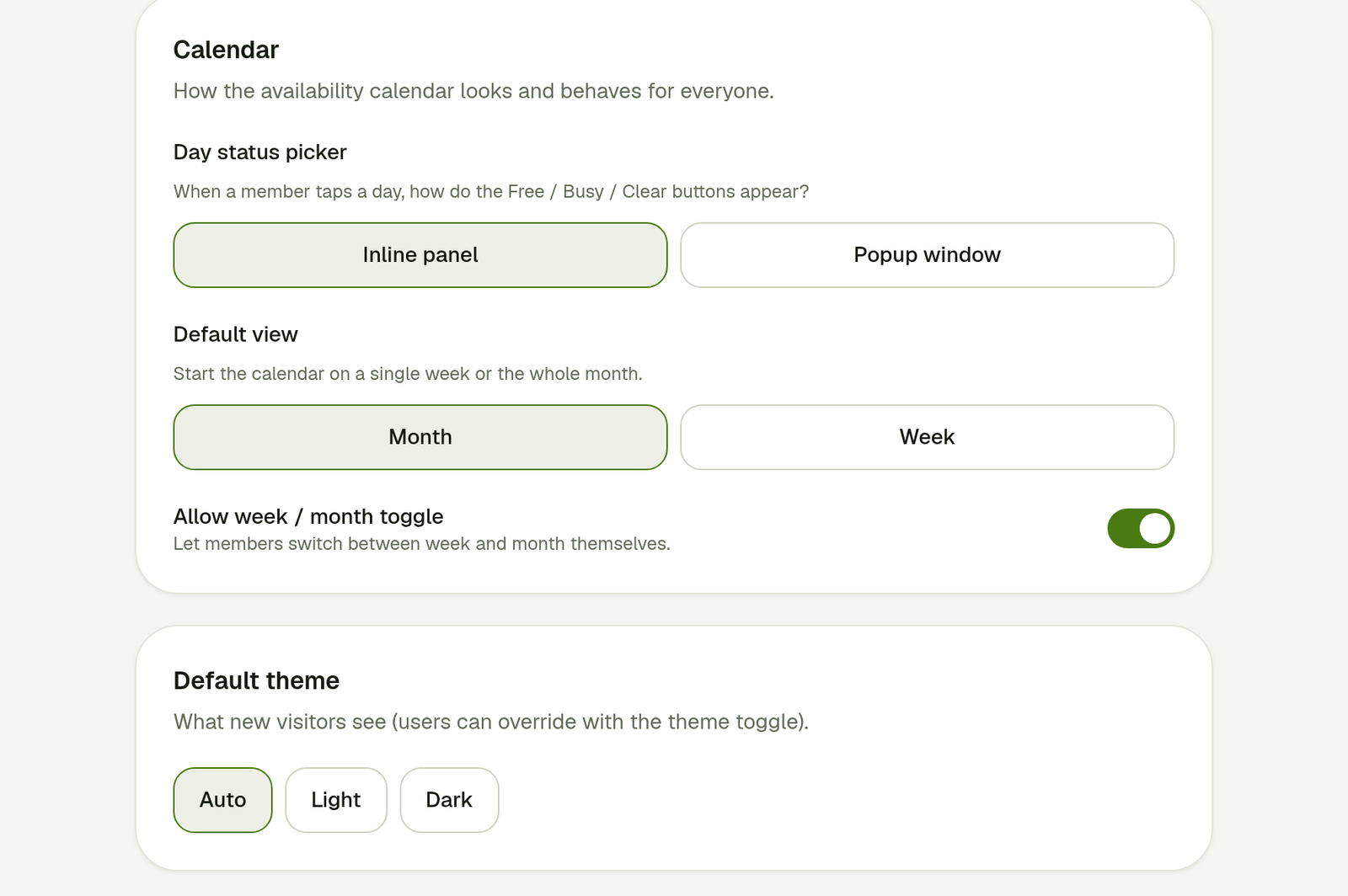
Because every color in the interface comes from design tokens, picking a palette re-themes the entire app instantly.
7. On your phone
Gatherly is designed mobile-first. On a phone it uses a bottom tab bar, the calendar keeps its free and busy colors at a smaller size, and the app can be added to the home screen to open full screen like a native app.
8. The brand refresh (September 2026)
As the product matured, I rebuilt Gatherly’s visual identity around its logo: a map pin with a G inside it, a literal “here’s where we’re meeting.”
Palette. The logo’s leaf green leads, deepened slightly for buttons so white text stays readable. Lavender is the second color, for highlights; green and lavender is an unusual, upscale pairing. A small honey accent adds warmth, the neutrals carry a faint green tint, and dark mode is a deep forest night rather than flat black. It ships as the Grove preset in the admin panel.
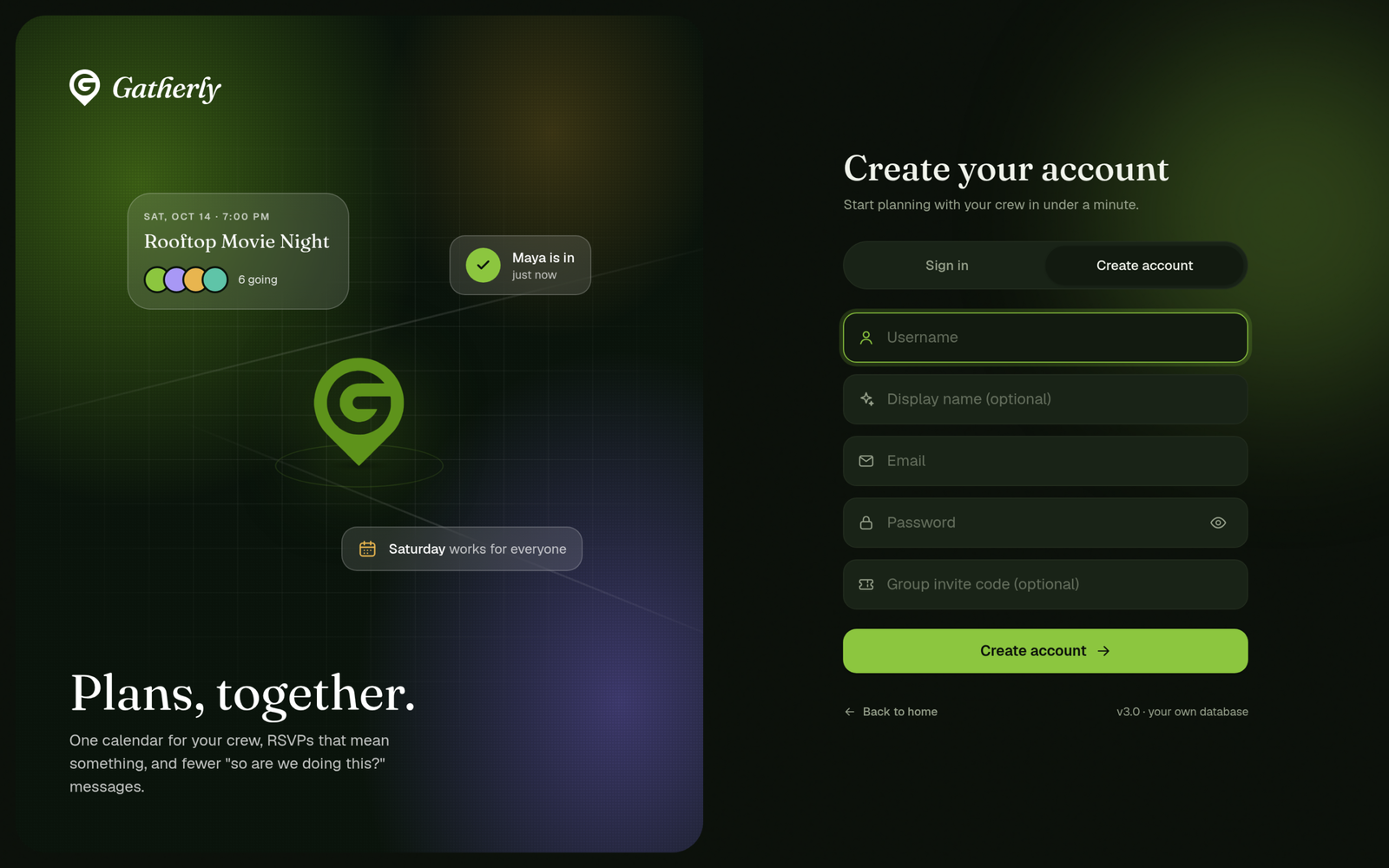
The logo, everywhere. I traced the logo into a vector so it stays crisp from the 16px favicon to large hero sizes, in green or white. It appears in the top bar, the favicon and home-screen icon, the sign-in and register screens, and the loading screen.
Motion with meaning. The pin drops onto the page with a small squash and settle, then location-beacon rings ripple out from its tip, the way a map marks a destination.
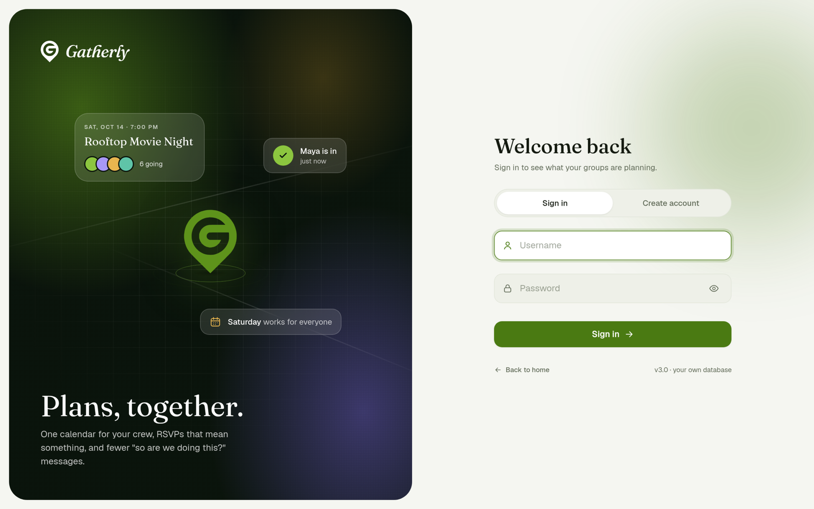
The sign-in panel is a small scene: a faint street-map grid, the pin at the center, and a plan coming together around it. The public landing page shows a live calendar card that always displays the visitor’s current month, with today selected and a mix of free and busy days.
9. Premium: a subscription system, not just a checkout (September 2026)
The free tier caps each event at 10 guests. That cap marks the exact moment a host is most willing to pay, so I designed Premium around it: discovery, plan comparison, an honest trial, failed payments, and changing or leaving a plan later. Premium is currently a design preview; no payments are processed.
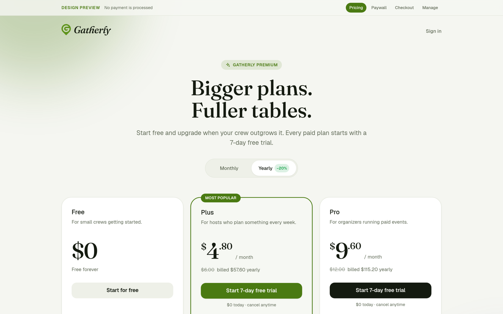
Pricing. Three tiers: Free, Plus ($6/mo, or $4.80/mo billed yearly) and Pro ($12/mo, or $9.60/mo billed yearly). Prices are the largest type on each card, yearly billing shows the struck-through monthly price, and on phones the recommended plan moves to the top.
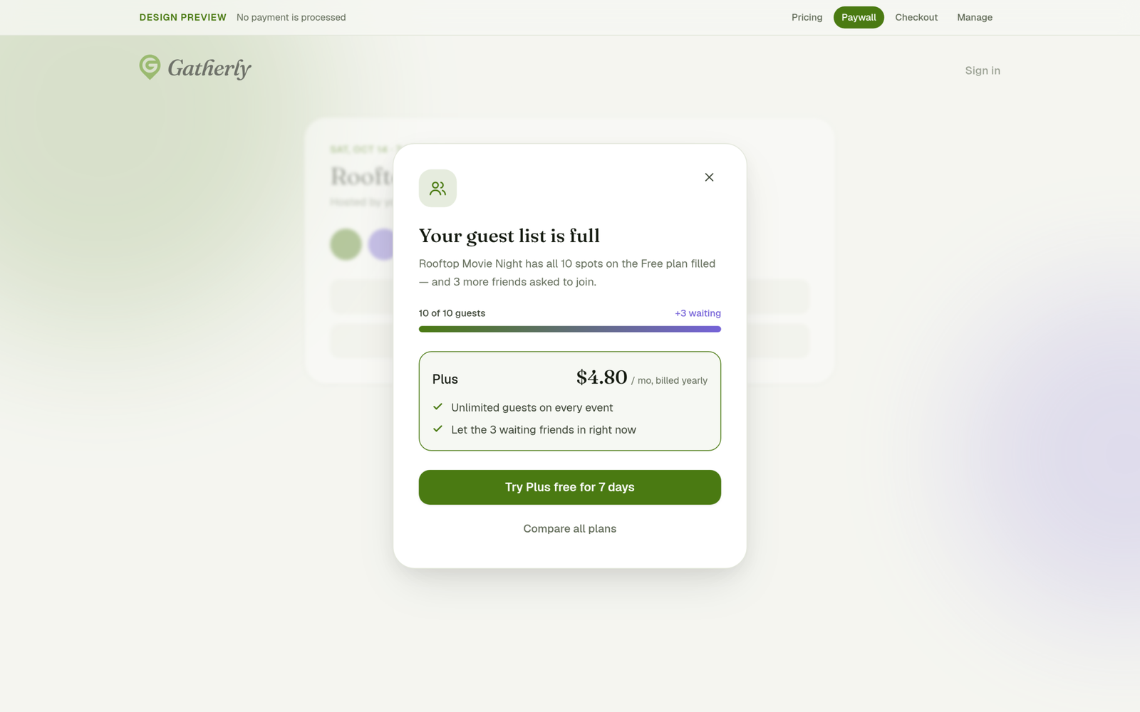
The paywall at the moment of need. When an event’s 10 free spots fill, the host sees the upgrade over the event itself, with “10 of 10 guests, +3 waiting” and one clear offer: “Let the 3 waiting friends in right now.”
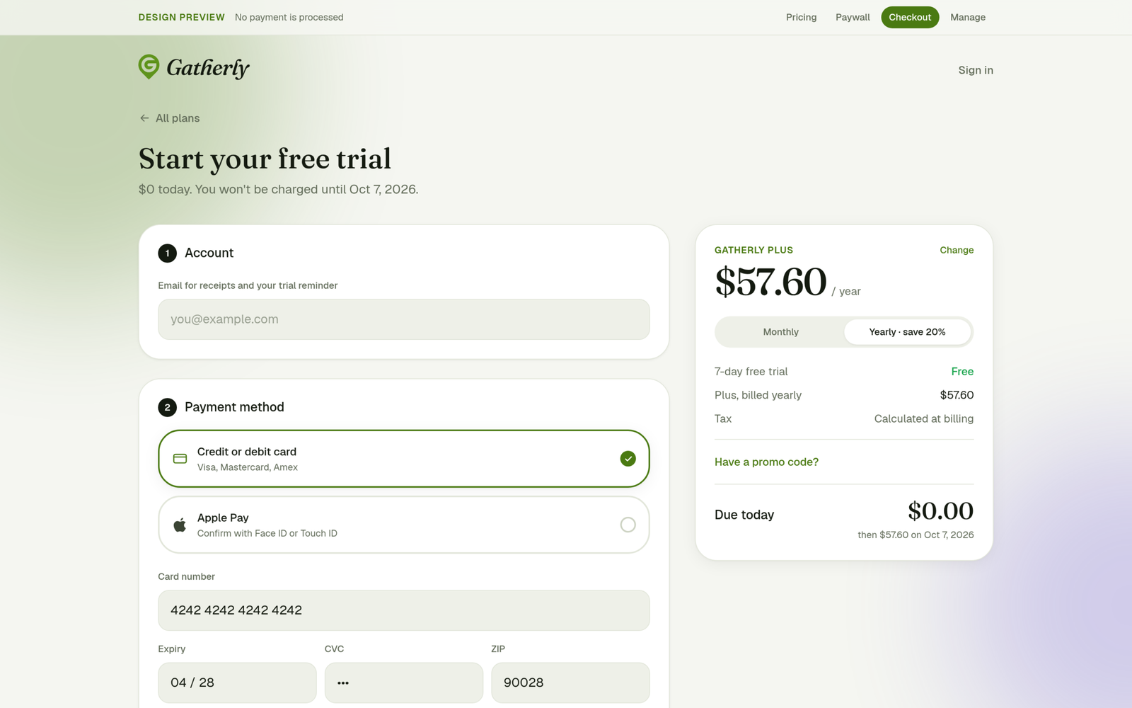
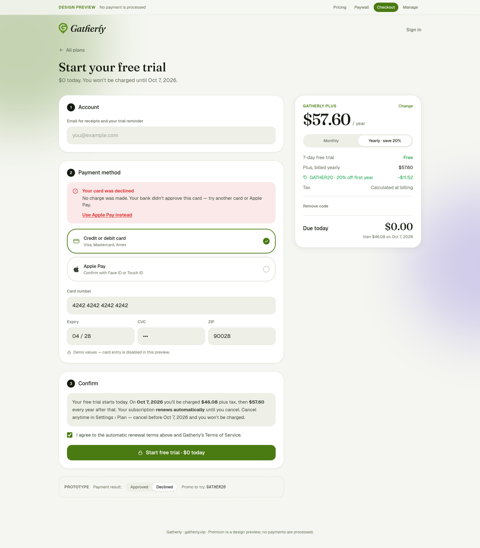
Checkout. The order summary comes first, “Due today: $0.00” is the largest number, and a plain-language auto-renewal disclosure with a required checkbox sits before the subscribe button. A declined card gets a designed error with a one-tap recovery, and promo codes stay tucked away until needed.
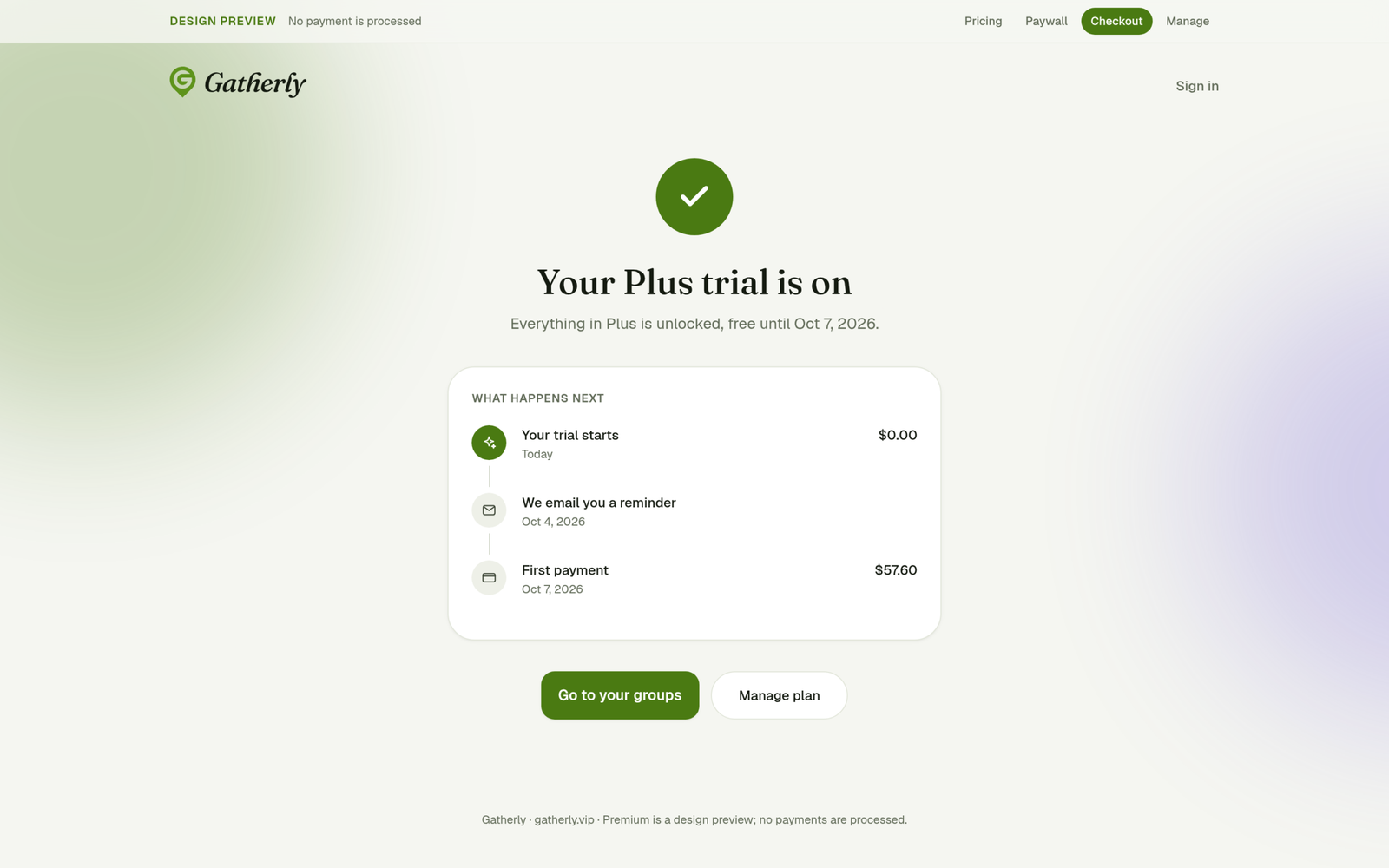
Confirmation. A timeline instead of a receipt: the trial starts today at $0.00, a reminder email arrives 3 days before it ends, then the first payment.
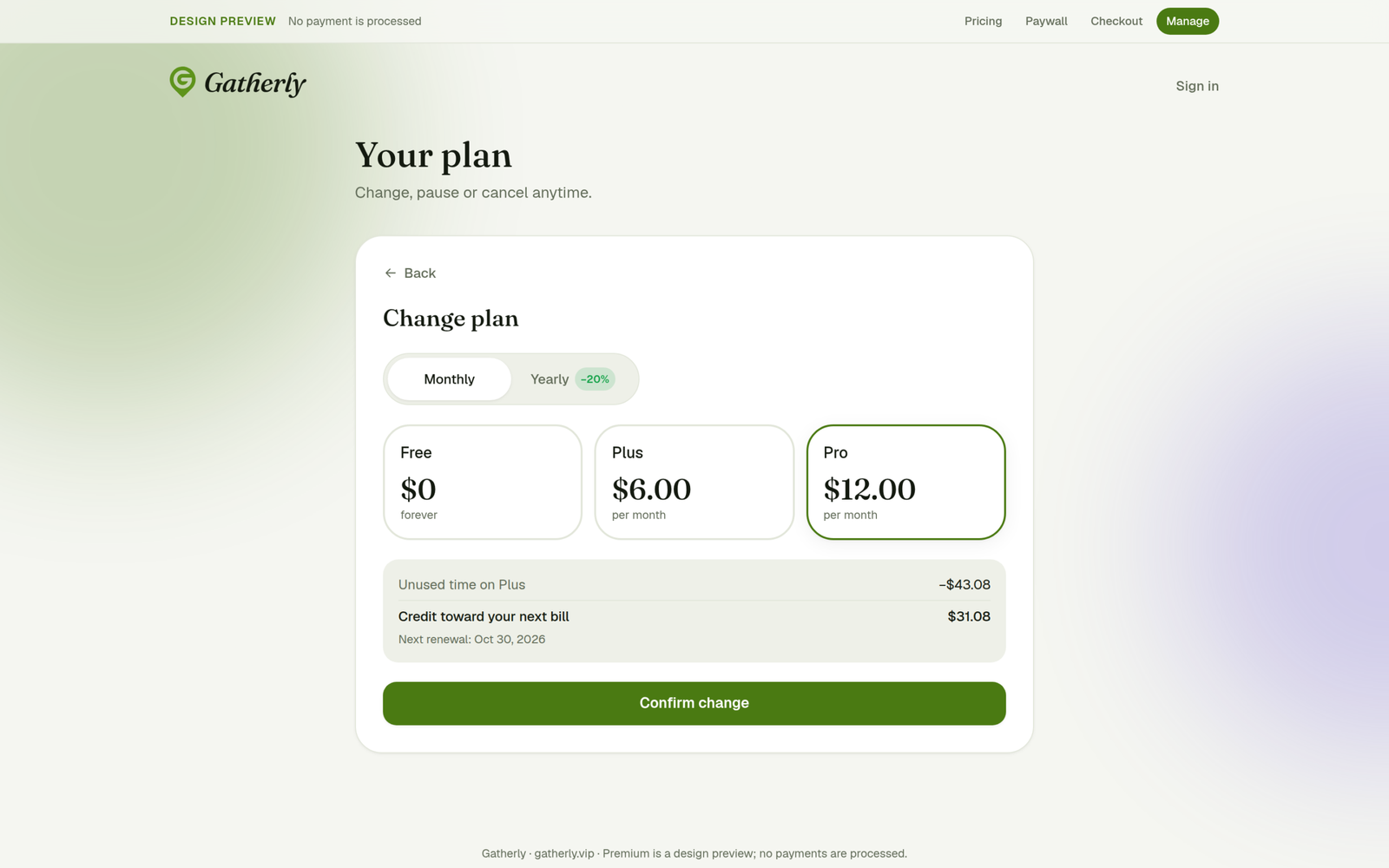
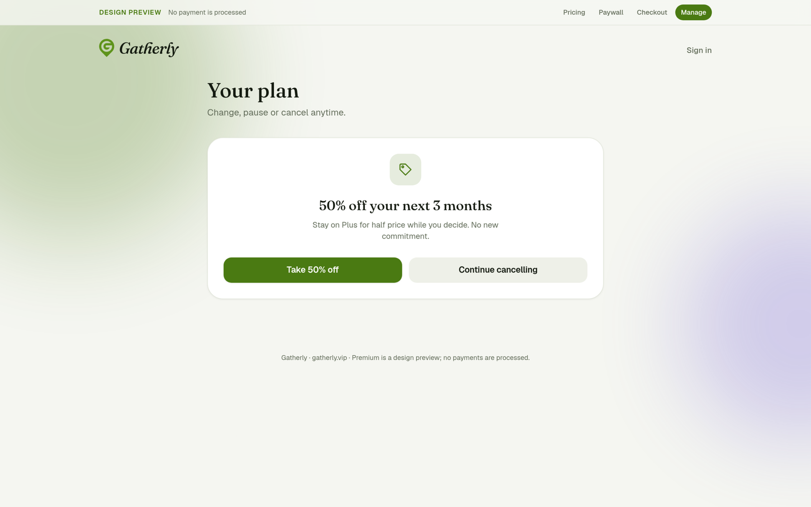
Managing the plan. Plan changes show the proration math up front. Cancelling goes reason → relevant offer → confirm → undo, and “Continue cancelling” always gets equal weight with the offer.
Built for real
Gatherly is a live product, not a mockup. The front end is a React single-page app; the back end is a PHP API with its own database covering accounts, groups, availability, plans, RSVPs, activities, votes, notifications and email. Everything visible here, from the palettes to the calendar behavior, is driven by real settings.
Every screen is checked at desktop and phone sizes, in light and dark mode. All motion uses transform and opacity only and respects the operating system’s reduced-motion setting.
What’s next
- Connect a real payment processor for Premium
- Trigger the upgrade paywall from other limits, like groups and co-hosts
- Smarter date suggestions based on when the most people are free
- Measure what matters: how many ideas become plans, and how many plans actually happen
Gatherly is an independent product I design, build and run. See also: The Giftings, Lumio, EventIQ.
Screenshots of the signed-in app use made-up sample people and groups.