I post carousels on Instagram all the time, and every single one used to take the same slow routine: write the copy, open a design app, set up the slides, place the photos, add my handle, export, then write the caption. The idea was the easy part. Everything after it took an hour.
So I built Just A Sec, a carousel engine that turns anything I give it, an idea, a topic, a few notes or an article link, into a finished, ready to post carousel, with the caption included.
From a quick idea to seven slides
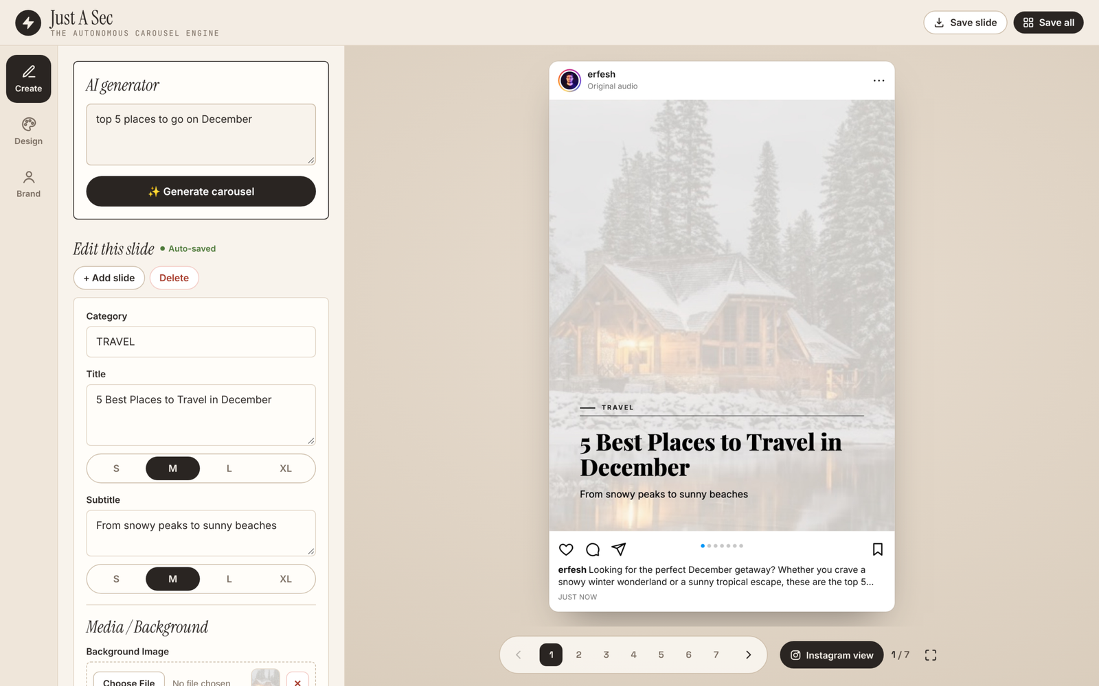
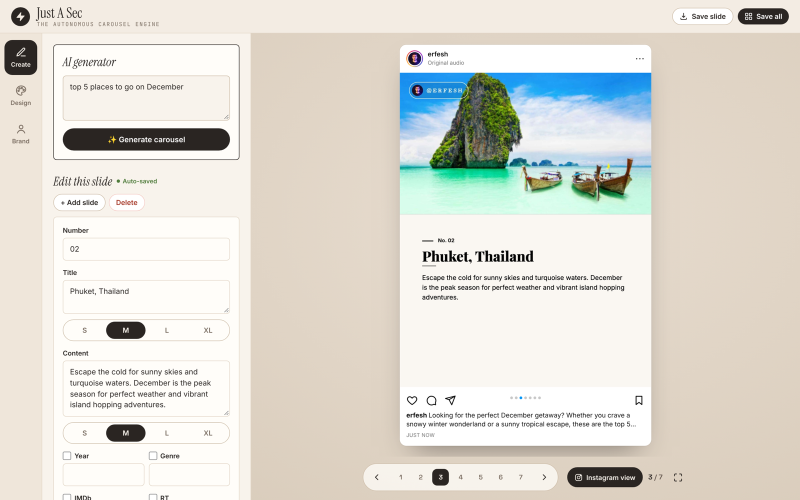
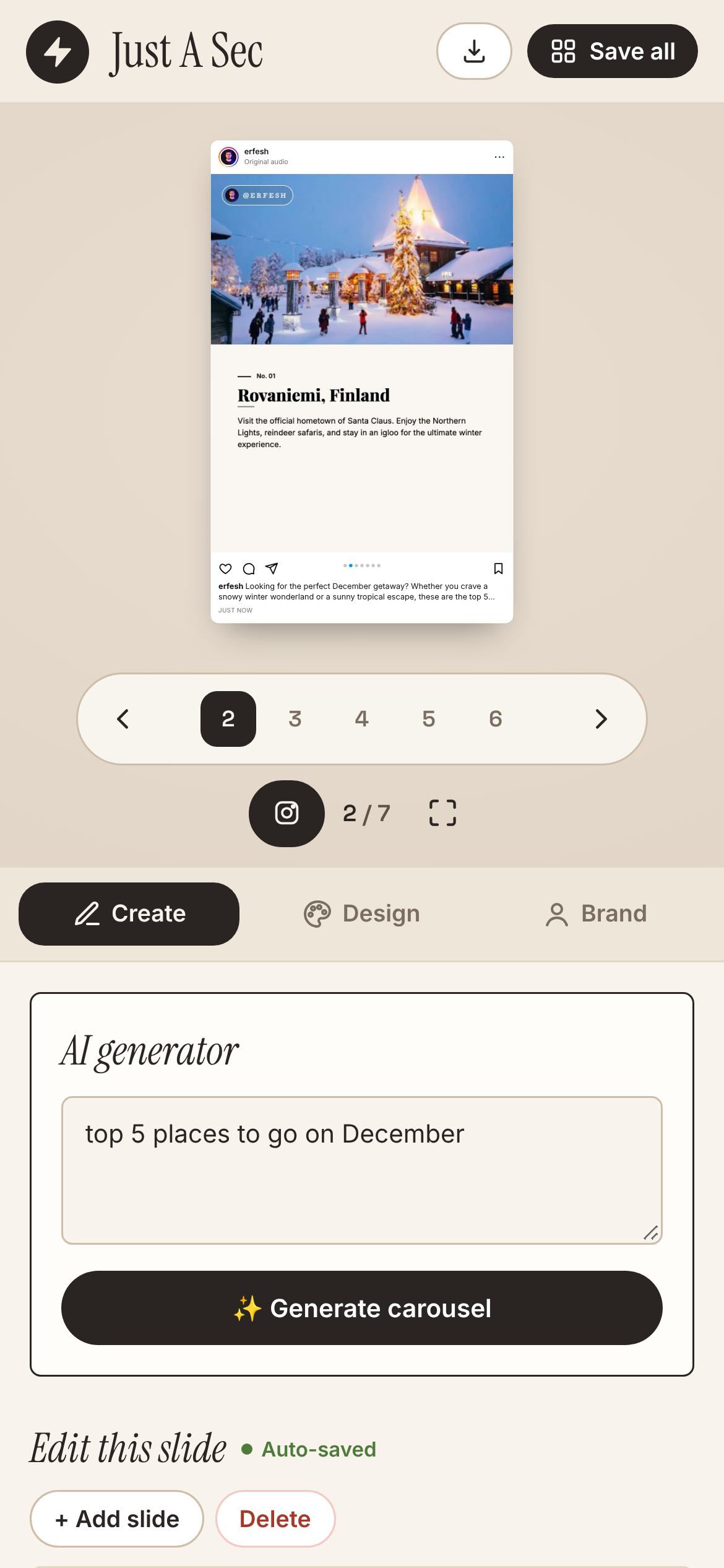
I typed “top 5 places to go on December” and Just A Sec came back with seven slides: an intro, one slide for each place with a photo, a short description and a number, and an outro with a call to action. It also wrote the caption and the hashtags, so the whole post was ready in one go.
The input can be anything. A rough idea, a topic, a few lines of notes, or a link to a long article or news story. For a link, Just A Sec reads the article first and builds the slides from it.
Every slide stays editable
AI gets me to a first draft fast, but I always want the final say. Every slide can be edited right next to the preview: the title, the text, the number, and the size of each line from small to extra large. I can add a background image, a cutout image, or a photo placed at the top, side or bottom of the slide. Changes show up instantly and save on their own.
Six looks, one click each
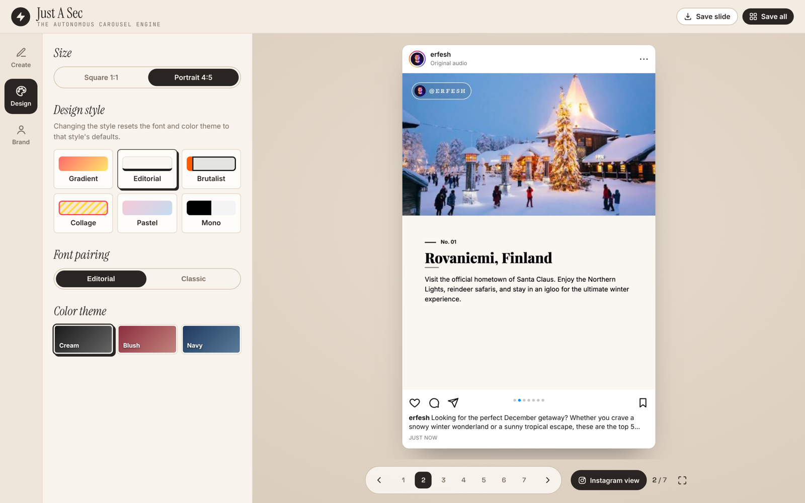
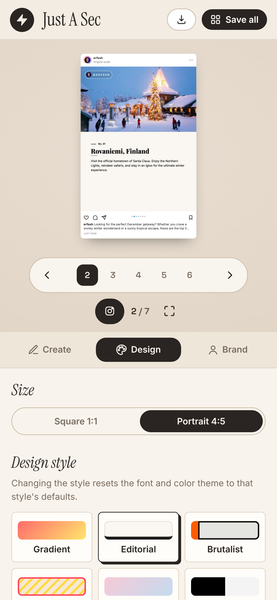
Just A Sec has six design styles: Gradient, Editorial, Brutalist, Collage, Pastel and Mono. Each one comes with its own font pairings and color themes, and the carousel can be square or 4:5 for the feed.
My brand on every slide, except the first
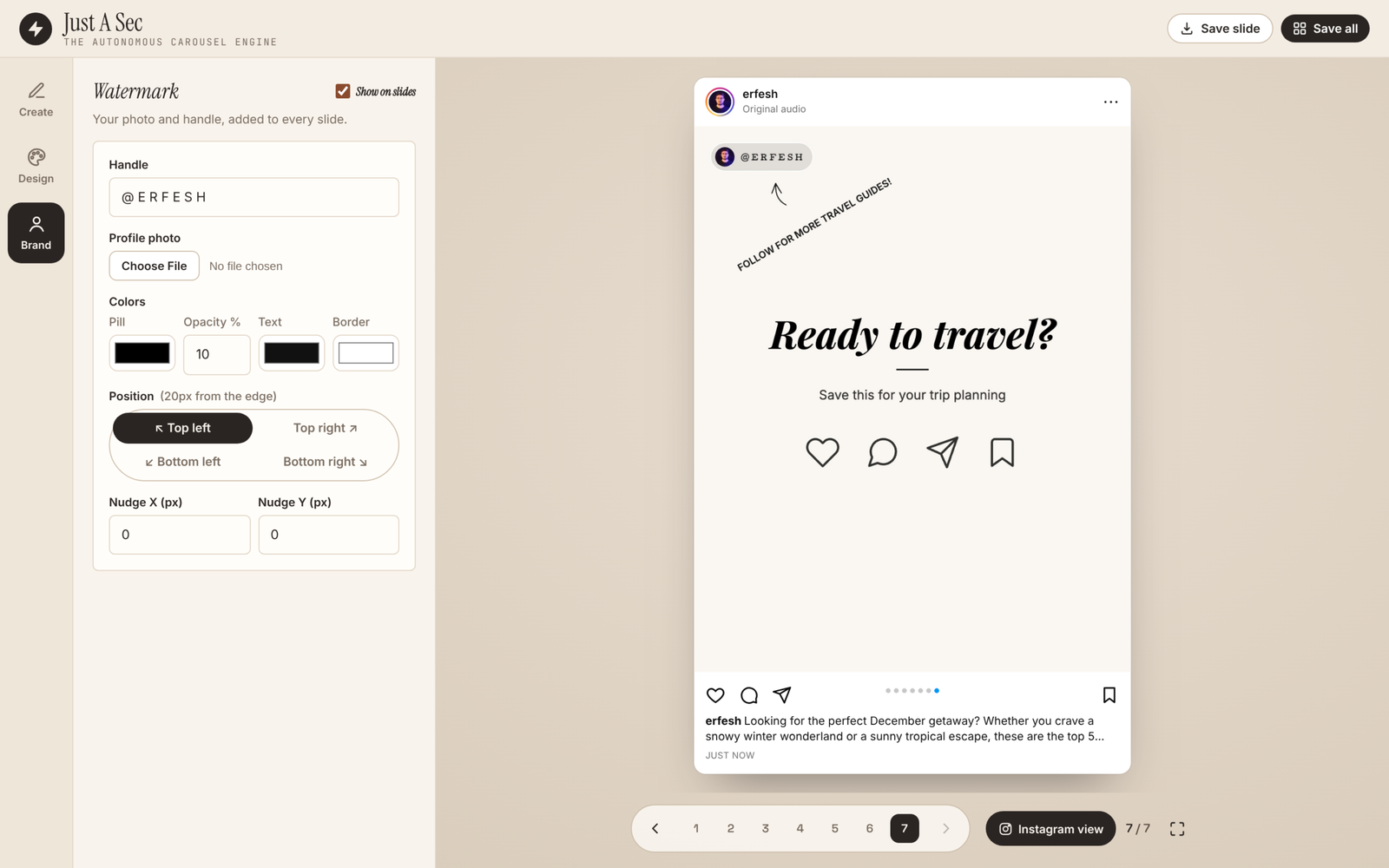
The Brand tab adds my photo and handle as a small watermark on the slides, with full control over its colors, corner and exact position. The first slide stays clean on purpose. The cover is what stops the scroll, so nothing should compete with the headline.
See it the way followers will
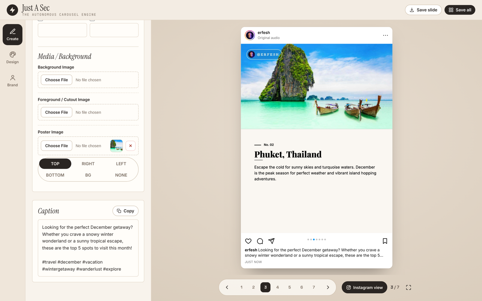
My favorite part of the redesign is the Instagram view. The slide sits inside a real looking post, with my avatar and handle on top, the like, comment, share and save icons below, the carousel dots, and the caption cut off after two lines, just like in the app. It is the fastest way to judge whether a slide works before it ever goes live. One click turns it off when I only want the slide, and there is a full screen mode for swiping through the whole carousel.
Redesigning my own tool
The first version worked, but everything lived in one long scrolling panel, so I spent more time hunting for settings than designing. I reorganized it around how I actually work: Create for the content, Design for the look, Brand for the watermark. A slim icon rail keeps all three one click away, and the preview gets the most space on the screen. I explored four directions before landing on this one, a calm editor layout in the same warm paper colors and serif type as this site.
It works on the phone too. The preview stays on top, and the tabs and editor sit below it.
Ready to post
When the carousel looks right, Save all downloads every slide as a high resolution image, numbered in order, ready to upload. What used to take me an hour now takes a few minutes, and most of that time goes into the part I enjoy: picking the best photos and fine tuning the words.